Monday, March 30, 2009

KO Flatte Matte Polishes

I had been drooling over these polishes ever since I first saw them, and then, out of the blue, a very lovely and wonderful person sent me them as a gift! I couldn't believe it. I still can't! Thank you, amazing generous friend :) Your gift is loved and appreciated.

Anyway, enough mushy stuff, on to the polishes!

These polishes were created by the makeup artist Mike Potter- known for his work on Hedwig And The Angry Inch. Just from reading that sentence, you know they're gonna be awesome, right?

They are.


Flatte Black. That's pretty much a description in and of itself. It's flat black. It's very black and very matte.


Powder. It's kind of an off-white matte creme. It's not as matte as Black, this shade has more of a satin finish.

KO (Knockout) also has a matte pink called Calamine and a matte red called Karen, but I haven't tried them.

First, let's talk about the formula. It is much thicker than your average polish. It also dries very quickly. The combination of those two qualities can lead to some difficulty in application. Just make sure you have enough polish on the (gigantic) brush and work carefully and you shouldn't have a problem. What you see is what you get, so be careful to apply them evenly.

The Flatte Black is opaque in one coat. Powder needs three coats to be even an opaque.

The polishes start out matte, but by the end of the day are a satin finish. They become smoother and shinier the longer you wear them. Kind of cool, but I wish they stayed matte!

Another odd thing about this polish is that when it dries it becomes very brittle. After I had been wearing Black for a few days (I was sick and couldn't change my polish) it began to crackle and little black flakes would fall off randomly. I have never seen that happen with any other polish- it was so weird!

Now comes the interesting part- the bottles.

The bottles are a work of art. I absolutely love them. They are beautiful and a polish I would be proud to display.


They have long brushed metal handles, a matte finish frosted glass with KO and Flatte being the only shiny parts. They are flat and have a scallop shape. Lovely. Oh yeah, and they're GIGANTIC.


Here they are compared to a regular OPI bottle to give you an idea of how huge they are. They are really, really tall and pretty wide.

They look awesome, but the super long brush and handle make them difficult to work with. It is very tricky to maneuver the extra-long brush stem, and since the stem is so long it's also hard to get all of the excess polish off of it to prevent dripping.


These polishes are incredibly cool and even if you aren't wearing them they're nice to look at.

They remind me of another brand of extremely cool matte polish with awesome bottles...


ManGlaze.

ManGlaze will always be my favorite matte polish, but the KO polishes are different enough from ManGlaze to warrant owning both.

KO is just plain flat black that becomes shiny after a few hours of wear. ManGlaze Black (I believe it's now called 'The Death Tar') and Grey ('Fuggen Ugly') have depth and texture. They're packed with these little particles that make the polishes look like smooth asphalt that stays matte without topcoat, but transforms them into an uber-sparkly black or grey polish when topcoat is applied.

I will do a side-by-side comparison when I get a chance, but I just wanted to point out that yes, they are different.

KO Flatte Black is one of my new favorite colors. It's seriously badass. But, if you want to keep it looking totally matte and intimidating looking, you will need to invest in the KO Flatte Top
topcoat. I have a suspicion that it's nothing more than a ridge filler or nail strengthener in a topcoat bottle, but I've never tried it so I can't say for sure. China Glaze used to have something called Flat Top -it's discontinued but still available at some beauty supply stores- it was a topcoat that made your polish matte. I wonder if they're similar?

I love matte finish polishes and I have a feeling that we will be seeing a lot more of them this year. Bring on the mattes!!! (And make a green, please.)


Saturday, March 28, 2009

Color Club Fall 2008 Dance To The Musique Collection Revisited

The first time I posted about the Dance To The Musique collection, I only posted one picture of 'skittles'- one color on each finger and one bottle in my hand. The reason I did this was not because I didn't love the collection- it was because the sun was setting and I needed to get the picture taken in the fastest way possible since I didn't feel like swatching one collection over two (or more, depending on the sun's cooperation) days.

Since is was such an incredible collection, it deserves a real post with real swatches.


After Hours. A shimmery, smoky grey. A lot of other charcoal-grey shades have a strong blue tone to them, but this one seems a lot more neutral.


Electronica. Deep sparkling purple. This color is actually purple, despite how blue it looks in my picture. Purples are just, for some reason, impossible to photograph. They always come out blue no matter what I do!! Anyway, Electronica is AMAZING. One of the best purples ever. It's deep but not too dark or black looking and it's packed with shimmer, miniature 'flakies' and even what appears to be microglitter, though there is no hint of roughness to this polish. Perfection.


Feel The Beat. A coral-copper-orange duochrome. Yes, this is a duochrome. It reminds me a little bit of Misa Bo-Jangles. It's coppery red all over the polish and at the edges it's orangey-coral. I couldn't really capture the full effect of the duochrome, but it's definitely there.


Groove Thang. Blackened vampy purple shimmer. At first, this color reminded me of an OPI- maybe a mix between Black Tie Optional and Ink or Who Are You Wearing?... It has that sort of color-changing 'beetle shell' quality to it. It is very dark, almost black, but any light hitting it brings out a purple glow on the surface of the polish. Pretty unique and ultra hot.


Slow Jam. Warm reddish brown shimmer. This color screams FALL!!!! to me. Is this what you would call 'burgundy' or is it too brown? I'm not sure. Either way, this color rocks because it's one of those 'lit from within' shades I love. It looks like it's dark on the edges and the center is brighter, almost like it's glowing.


Velvet Rope. Red shimmer. You will rarely see me get excited over a red shimmer... But, even if I am not absolutely in love with it, it is still beautiful. Velvet Rope is bold and loud and sparkly. It really stands out against my skintone and it's almost like there's a miniature neon sign above my hand with an arrow pointing down saying "LOOK AT MY NAILS". Very flashy, indeed.


Despite three of the six shades being red or almost-red, this was still one of my favorite collections of 2008. I would wear (and have worn, multiple times) every single color in this collection. Electronica is so breathtakingly beautiful you can't help but want to stare at it all the time. Sometimes I just take out the bottle to look at it! It's that good. And Groove Thang, same with that one. There must be some color-obsessed geniuses working at Color Club because they consistently release awesome and adventurous shades. Even their sheers/pale/french manicure shades rock!!

The formula on these is perfect. Even though Color Club isn't as popular as one of the 'big brands' like OPI or Essie, their formula could pass as high end any day. It's pigmented, smooth, even-textured, fast drying and long wearing. It's not too thick, not too thin, not at all runny. The bottles and brushes are great- no weird shaped bottle to knock over and no defective bristles. They do have a tendency to get stuck shut- I mean really, really stuck... I have a bottle of Yell-Oh! that I haven't been able to open for over a year. Nothing I do seems to work, I think I just have to buy another bottle. So, make sure the necks of your Color Club bottles are clean!

One of the best things about Color Club is the price. I think the average price for these online and in nail supply stores is around $2.50 each. With a quality just as good as OPI and even better than some other higher-priced brands, it's truly a bargain. Low price, high quality, amazing shades. They make nail polish accessible.

Overall, incredible collection. Fantastic sexy vampy fall shades, great formula, great price, gorgeous makeup on the model that appears on the packaging.... You can't go wrong with Color Club! I hope they continue to release fun, funky colors that appeal to everyone- not just the salon consumer but us, the hardcore nail junkies!

Friday, March 27, 2009

Piggy Polish Spring/Summer 2009 Collection

With the constant barrage of Spring and Summer collections being thrown at us, I think I've been swatching non-stop! Just a few more collections to go and I'll be able to rest for a little bit and get to all the requests and comparisons on my list.

Okay, here we go, one more Spring/Summer collection to drool over: Piggy Polish!


Azure Thing. A bright, frosty turquoise blue. This is a beautiful color but it's very sheer. I have on three coats and you can still see my nail through the polish. The sheerness makes it awesome for layering- the day I got these I layered them all over black and wow, startlingly awesome colors resulted.


Dog Daises Of Summer. A pearly metallic yellow. The name confuses me a little. I know it's supposed to be a play on "Dog Days Of Summer" but were they trying to go for Daisies? Typo? Am I just reading it wrong? Either way, this is a great summer color. The best part of this color? It's NOT STREAKY!!! It's basically a law of nail polish that yellows have to be streaky, but this one isn't. So, if you've been wanting to wear yellow but are too frustrated to deal with them, you might be pleased with this one.


Grin And Berry It. A bright, almost jelly-like coral-fuchsia creme. This is one eye-catching shade. It's not really what I think of when I hear the word 'berry'- it just doesn't look berry-like to me. To me, this is more of a very bright coral verging on fuchsia. Staple summer color, executed very well.


Lily's Pad. Pearly bright grass green. I know, I've posted this color before, but it's worth seeing again! It's fantastic.


Live With Purplish. A nearly-neon purple creme. I love these types of shades. It is an extremely bright purple/pink creme but it's not quite neon so it doesn't dry matte. There are never enough bright purples in the world.


The tagline states, "Goes on toes!" but there's no reason you can't wear these on your fingers. I do!

The formula is excellent. These polishes are quite sheer, I did three coats in these pictures, but the formula is so thin and smooth that doing three of more coats is easy. I'm pretty sure that these are big three free, but they don't feel like it. The formula is too smooth. These all dry quickly. No complaints.

I love all the colors. They're bright, flashy, adventurous, and best of all, not boring! I'm so sick of boring polish colors being released all the time and I don't think Piggy Polish even has a boring color in their line. I love them for that. They are willing to take a chance and release fun, cheerful shades instead of the depressing red cremes and sheer pinks that plague the polish racks.

Another thing I love about Piggy Polish is that they come with toe rings. I believe the flowers on the toe rings used to be porcelain roses, but now they are made of a much less fragile plastic polymer clay type substance. Each toe ring is coordinated to the color of the polish in the bottle. Genius!

Overall, Piggy Polish rocks and their polishes always excite me and rarely, if ever, disappoint me. Their line contains brights, blues, greens, purples, duochromes and the holo glitter that I can't live without- Sunshine On Snowflakes.

The only retail store I've ever seen selling Piggy Polish is Ulta, but I believe you can order directly from Piggy Polish as well.

Thursday, March 26, 2009

OPI Summer 2009 Colorcopia Collection - 20th Anniversary of OPI

Colorcopia is a special OPI collection- instead of being a set of twelve brand new colors, they have re-released the most popular or best-selling shades from classic OPI collections.

I absolutely can not think today so please don't mind my incoherent babble. I can't even remember my middle name right now, much less construct an understandable sentence! Also, another warning ahead of time: OPI picked the twelve most IMPOSSIBLE to photograph shades they could think of, so not all of these pictures are 100% color-accurate. I did the best I could, but pinks and reds do a number on my camera!

I have many thoughts about this concept, but I'll save that for last. Swatches first!


Berry Berry Broadway. Re-release from the New York City Collection (2000). A bronzed berry shimmer.


Cancun Fiesta. Re-release from the original OPI launch in 1989! A medium blue-toned pink with very subtle shimmer. This is not a very good representation of the shade- it's more saturated and leans a little more purple in real life.


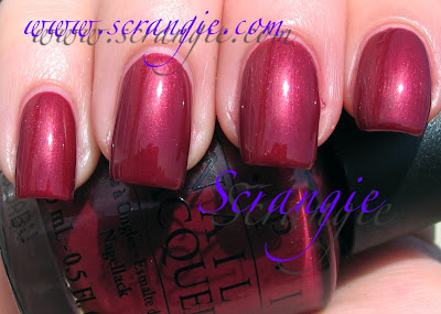
Copper Mountain Copper. Re-release from the Winter Resort Collection (1995). A rich red-mauve near-metallic shimmer. Not really what I think of when I hear 'copper' but it's still a beautiful autumn shade.


D.C. Cherry Blossom. Re-release from the 9091 Collection (1990). A saturated blue-pink creme. This color isn't the most unique but it's really hot. On the rare occasion that I do wear pink, I love these nearly-purple bright pinks.


Florentine Fuchsia. Re-release from the International Collection (1991). A medium fuchsia jelly. This is also a fairly poor representation of this shade- it's nearly impossible to photograph. It's very jelly-like: squishy looking and nearly translucent but not sheer. It's more of a berry shade but it's not like Misa Push Upon It or Zoya Moxie.


French Bordeaux. Re-release from the International Collection (2001). A warm red with slightly magenta-hued shimmer. This color is a little more brown in real life. It appears a lot more brown in the bottle, but when applied it is a brighter shade of red than expected.


Kinky In Helsinki. Re-release from the European Collection (2002). Pearly metallic fuchsia with blue-pink duochrome. I love the name of this, it was one of the first OPI polishes I ever bought just for the name. This is a really glowy shade, it looks lit from within.


Mediterranean Moonlight. Re-release from the Mediterranean Collection (1994). OPI describes this as "a light shade of gleaming caramel" but it's so not caramel. It's peach... Deep peach. It's a little more faded looking in real life.


Purple-opolis. Re-release from the Greek Isles collection (2004). A light, shimmery red-toned purple. This looks really different in sunlight and indoors. The sunlight picks up on the warm tones in the polish, but in dim light the cooler more blue purple shade comes out. Very, very pretty. Although, I'm pretty sure this is a bit different from the original release, but I can't find my bottle to compare. I need to re-organize. Ugh.


Sahara Sapphire. Re-release from the Painted Desert Collection (1998). A metallic blue pearl. This goes on with heavy brushstrokes, but they fade a little bit as the polish dries. They don't completely disappear, but they're not too bad. It has the same texture as Pike's Peek-A-Boo Purple. This almost has a hint of violet to it in certain lights. Serene looking.


Shootout At The O.K. Coral. Re-release from the American Collection (1995). A bright coral with blue/pink duochrome. This was my go-to pedicure color for years. It is very bright but not quite neon.


Venus Di Violet. Re-release from the Collezione Italiana (2001). A soft lilac pearl with blue-violet duochrome. A very unusual color!


I think it's really cool that OPI re-releases shades from long discontinued collections. I love old polishes and I love that people will have the chance to be able to buy them again for a regular price. However...


... I think they picked the most bland, boring shades they could find! Okay, there are a few old favorites of mine in this collection of re-released shades, but three reds? Three pink cremes?? Cancun Fiesta isn't really a creme, but the shimmer is so subtle that it could pass as one.

OPI has released some *incredible* unique shades in the past and I would have loved to see them as part of this collection. I feel like the colors they chose are really playing it safe. It is stated that the colors selected for this collection of re-releases were past best sellers. I believe that. These are the types of colors that tend to sell really well. That doesn't necessarily mean they're unique, but they'll most likely be very popular.

If I had to choose twelve shades to re-release in my very own Colorcopia, they would be these:

1. Rainforest
2. Jasper Jade
3. I Get A Kick Out Of Gold
4. Black Tie Optional
5. Crim-Sun
6. Amethyst Abyss
7. Mystic Moonshine
8. La Boheme
9. Affair In Times Square
10. Vampire State Building
11. Real Teal
12. Home On The O-Range

Okay, that's just one possible set I can think of- there are hundreds of combinations of 'vintage' awesome colors that could be re-released. Those are just a few long-gone favorites and impossible to obtain wishes of mine.


Overall, not a terrible collection but not terribly adventurous. I love a lot of the colors- Venus Di Violet, Kinky In Helsinki, Shootout At The O.K. Coral, Florentine Fuchsia, Sahara Sapphire- that's almost half! I can't complain too much, but I would have liked to see some of their more unique shades in this collection instead of three uninteresting reds and three easily duplicated pinks.

And, just for fun, here are some very old pictures of me wearing the original versions of a couple of these colors:


Kinky In Helsinki.


Shootout At The O.K. Coral.


What would you have rather seen in this collection? Or is it perfect the way it is?

Lippmann Collection March Madness Sale


Lippmann Collection is having a sale!!!!!

25% off your order of $75 or more plus free shipping. Use code 0309madness at checkout.

Three days only.

I have lots of Lippmann swatches :)

Wednesday, March 25, 2009

OPI Fairytale Bride: Soft Shades 2009

OPI's soft shades for this year are actually quite interesting. Instead of being plain pale cremes, each color has a soft base color with a contrasting flash of another color. They're not true duochromes- the flash is strong enough to be noticed but not so strong that it overpowers the soft base color.

There are only four polishes in this year's collection. They are:


At First Sight. A very pale and soft nude/neutral base with gold flash.


I Pink I Love You. A soft baby pink with blue flash.


Isn't It Romantic? A very pale pink with green flash.


Otherwise Engaged. A pinkish-white with purple flash.


All pictures are three coats of polish. All of the colors are very sheer, as you can tell by the visible nail line even with three coats of polish. Four coats would make them almost entirely opaque. These can easily be worn with only one coat because they are not the least bit streaky and add an interesting shimmering pearl effect to the nails due to the colored flash in each shade.

The formula on these was fantastic. I had no application issues. They were neither runny nor thick like three-free polishes tend to be. The drying time on these was quite a bit longer than other OPI polishes. I'm not sure if it's because I did three coats or if it's the polish itself, but even with Seche Vite I could dent these up to two hours later.

Overall, they're not too bad for soft shades. They're not streaky! Not that I'm happy about more sheer pinks being released, but at least these have the fascinating colored pearl flash and there's only four of them instead of six.


I wish OPI's next Soft Shades collection would be a set of sheer crystal shimmers like Hollywood Blonde and Up Front And Personal, but in soft shades of blue, purple, gold, silver and green. That's my dream soft shades collection!