Tuesday, January 31, 2012

a-england The Legends Collection Swatches and Review

The long-rumored and highly anticipated a-england The Legends holographics are here! You may remember the first a-england holos, and how amazing they were... And then you might also remember Adina (creator and owner of a-england) saying that she was working on something holographic for the next collection... And now here they are, seven brand new a-england holos and they do not disappoint. I only have five of the seven, but the other two look just as fantastic as these.


Ascalon, Bridal Veil, Dragon, Tristam Eyes/Princess Sabra, Saint George.


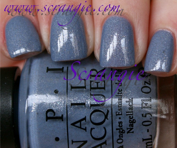
a-england Ascalon. Not only is Ascalon holographic, it's duochrome as well. It's a medium grey base with a strong purple flash. At some angles you can see an opposing teal/green flash where there's no purple. I don't think I captured any of the blue-green reflection in my pictures, but it's there in real life. This also has a pretty decent scattered holo effect, and it's the smooth kind of hologram particle, not the chunky glitter-style one like in Nubar Gem.


a-england Bridal Veil. This one is a super rich black with a subtle scattered holo effect. It is incredibly black and extremely pigmented. It's not a match to OPI My Private Jet (the original one) or Color Club Revvvolution. The hologram particles in this are small and sparse. It looks like a plain black shimmer indoors but in sunlight the rainbow effect does come out. It's more like Bloom Mena than any other black-based holo I've tried.


a-england Dragon. Dragon is the *perfect* name for this one. I've never seen a more dragony polish than this. It's a medium soft green base- somewhere in between fern and olive- and it has a fiery orangey copper-gold duochrome shimmer. It's also holographic, but a scattered holo. It looks quite a bit darker in the flash pictures than it does in real life, but the flash seems to show the holo effect the best.


a-england Princess Sabra (Tristam Eyes). Princess Sabra has a little note above the name that says "Tristam Eyes," and I think that's really cute. Tristam is Adina's cat and this shade seems to perfectly match the color of his eyes. It's a light golden olive green, very yellow toned. The holographic sparkle in this one is very strong.


a-england Saint George. This is a very saturated teal with holographic shimmer. It is dark and it is very rich. My picture doesn't adequately capture how colorful this looks, it's one of the nicest teals I've ever seen. The holographic effect isn't very strong in this, and the blue and green sparkles are dominant.

The other two shades in the collection are Princess Tears, which looks to be a soft purple holo, and Order of the Garter, which looks like a blue shimmer.

The application on these was excellent. Better than the previous a-england holos I tried. Some of them are opaque in one coat and have an insane amount of pigment to them. The others are opaque in two thin coats. No streaking or bald spots like many holographic formulas are prone to. The formula on these is very thick and dense, but not the kind of thick that feels dry and drags. Because of the thick formula, these are prone to bubbling. Be sure to do thin coats and wait a few minutes in between each just in case. The dry time was very good as well.

I think these are awesome. The combination of holo and duochrome really stole my heart. The non-duochrome ones are just as nice because they're extremely pigmented and saturated looking. The black is very black, the teal is very teal. I found these to be a joy to use and every shade looks fantastic on the nail. Plus, they're different from the rest of the holographic polishes in my collection; they're not the same old overdone silver/pastel blue/pastel purple holo polishes that we see constantly. The only flaw with them is that they can bubble if you're not careful.

These will be available soon on a-england.co.uk (with free worldwide shipping), but they're currently in stock at Llarowe if you want them now!

(This was sent for review.)

Monday, January 30, 2012

OPI Holland Collection for Spring/Summer 2012 Swatches and Review

OPI's traditional destination-themed Spring/Summer collection is all about Holland this year. The color selection for this one is really interesting because it's an odd mix of saturated brights and faded soft shades plus one random vampy shimmer thrown in to mix things up. Take a look!


OPI A Roll In The Hague. Way to start things off with a bang, eh? If you think this orange looks awesome in the picture, just wait until you see it in real life. It's bright and super saturated and as close as you can get to neon without actually being neon. There is one weird thing about it, though... It changes colors. It applies very bright but dries nearly two shades darker. But, once you put topcoat on it, it lightens again and dries slightly lighter than before topcoat. Very strange, but also super crazy gorgeous.


OPI Did You 'ear About Van Gogh? A really nice creamy neutral putty shade. It's a dusty beige base with a lot of grey and maybe a tiny drop of green in there somewhere.


OPI Dutch 'Ya Just Love OPI? This one is a vibrant red-toned grape purple with orange-red-pink shimmer. It dries a lot darker than bottle color. If you're thinking this looks familiar, it's because it's nearly identical to Zoya Tru.


OPI Gouda Gouda Two Shoes. OPI calls this rose, but on me it looks more like a dirty dark peach. I can see the rose in there, but it has a lot of peachy warmth in the base and in the shimmer. This has some red-copper duochrome shimmer, but it's very subtle.


OPI I Don't Give A Rotterdam! This is a dusty slate blue base with chunky gold and silver shimmer. The shimmer looks really sharp and speckled against the creamy base.


OPI I Have A Herring Problem. This is basically a warm version of I Don't Give A Rotterdam!. It has some teal and green tones in it, whereas Rotterdam has more of a periwinkle-slate cool colored base. The green tones in this bring out the gold shimmer particles nicely.


OPI Kiss Me On My Tulips. A hot pink creme. Has a bit of blue undertone. Very pretty but I feel like I've seen this color a million times. It looks a bit like the Nicole shade All Kendall-ed Up that just came out for winter.


OPI Pedal Faster Suzi! A very delicate light pink with some coarse silvery-white shimmer. The shimmer in this is like the shimmer in I Have a Herring Problem and I Don't Give A Rotterdam, but it's all silver, no gold. It looks crystalline and rough and very shiny.


OPI Red Lights Ahead... Where? This is a very bright coral-red creme. We're seeing a lot of this color this season, aren't we? This and the bright Tangerine orange. I guess they are pretty close to the Pantone 2012 Color of the Year... And while you're looking at Pantone's color of the year, you should take a look at their Spring 2012 color trends. I think you'll find it interesting!


OPI Thanks A WindMillion. This one is a dirty seafoam creme. Kinda like a mix between OPI Mermaid's Tears and OPI Stranger Tides. It looks calm.


OPI Vampsterdam. Whoa... random! Doesn't this seem so out of place with the dusty pastels and the bright corals and oranges? This reminds me a lot of the colors OPI used to do back in the day. Rich color, very fine frosty shimmer, velvety finish. This one is a dark raisin color. Warm and with a touch of brown to it.


OPI Wooden Shoe Like To Know? This is a chocolate brown with red-copper-gold duochrome shimmer. It looks like it has a tiny bit of purple to it in the bottle, but I can't really see the purple in it after it dries. This one also dries a lot darker than it looks in the bottle. The shimmer in it is very pretty, isn't it?

The formula on these was great. All of them were really smooth and even and didn't run or drip or bubble. The only one that gave me trouble was Pedal Faster Suzi! because it was sheerer than the other shades and it streaked. I did three coats of each shade and most of them needed all three. Dry time was great. The shimmers dry a little dull compared to the cremes, so be sure to remember your topcoat.

Overall, very nice collection. My favorite recent OPI Spring collection, right after India. Good balance of brights and soft shades. Nothing too sleepy or bland like some of the past Spring collections. What's really interesting about this collection is that there are a lot of familiar colors in it. It's like a mix of all the Spring collections we've seen so far. The orange, the coral, the speckled blue shimmers, the putty beige, the teal-green, the fiery purple shimmer... Do all the polish companies agree to do the same thing every year, or is there some kind of crazy corporate espionage going on each season? Either way, the colors are nice and the formula is perfect.

My picks are A Roll In The Hague, Did You 'ear About Van Gogh, Dutch 'Ya Just Love OPI?, and I Have A Herring Problem. Also, I think "I Have A Herring Problem" might just be my favorite OPI polish name ever now.

Holland Collection by OPI will be available February 8, 2012, at Professional Salons, including Beauty Brands, Beauty First, Chatters, Dillard’s, JCPenney, Pure Beauty, Regis, Trade Secret, and ULTA, for $8.50 ($9.95 CAN) suggested retail for each Nail Lacquer. For more information, please call 800-341-9999 or visit www.opi.com.

(This was sent for review.)

Sunday, January 29, 2012

Nail of the Day: Kat Von D Wonderchild with Finger Paints Twisted

My nail of the day yesterday (and technically today because I'm still wearing it) turned out so awesome that I just had to take a few pictures and share it with you.

Yesterday was one of those days where I kept getting frustrated and re-doing my nails every time I'd put something new on. The polish bubbled because I rushed and did my coats too thick, this color wasn't what I had in mind, this one has such bad formula that I don't have the patience to finish my other hand, so on and so forth.

Eventually I just gave up on trying to use a color I hadn't worn yet and decided to go with something I already knew I liked (that would be Kat Von D High Voltage Nail Lacquer in Wonderchild).

When I was finished applying it, I was happy with how it looked... But then I glanced over and saw my bottle of Finger Paints Twisted sitting there on the table and thought what the heck... Let's try it. If I'm already wearing a polish I love, putting another polish I love on top of it is better, right?

Luckily, this time it was!

This is Kat Von D High Voltage Nail Lacquer in Wonderchild (three coats) topped with Finger Paints Twisted (one coat). I only did a very thin coat of Twisted because I needed this to dry quickly, but even with such a thin coat, it still had just the right amount of flakes. The flakes take on more of a pastel look over Wonderchild and it reminds me of Easter candy. The flakes also make the already shiny/sparkly finish of Wonderchild look even more metallic. Everything looks super glowy and bright and reflective and the little flashes of rainbow color from the flaky topcoat compliment the duochrome pearls in Wonderchild perfectly. Very happy with how this layering experiment turned out.

Now that I'm on the second day of wearing it, it looks like the flakes have started to sink in to the polish and make the finish less smooth. I think I'll add a quick coat of Gelous over this and keep it on for the rest of the day. I love this so much that I might even consider wearing it on Monday, too...

Saturday, January 28, 2012

Sally Hansen Insta-Dri Fast Dry Nail Color in Bronze Ablaze

Do you ever have one of those moments when you're in a drugstore and you see a new polish display, a bottle catches your eye, you pick it up, look it over, and then go "Ehh... it's not that cool." and you put it back? But then you can't stop thinking about that color, so you decide to get it next time you're at the store, only to find that it's the only color missing from every display?

This one was one of those polishes for me. I thought it looked really cool at first glance, but then I thought it would be one of those deceptive drugstore colors where the duochrome effect in the bottle doesn't show up on the nail, leaving me with a plain, boring shimmer that I already have several versions of already. I probably picked this up and put it back four or five times before I decided that I had to have it just in case it was as interesting as it looked in the bottle. Of course, by the time I decided to get it, it was gone from every place I had seen it before. I did eventually find one last bottle of it and I'm glad I did!

Okay, that was a long and pointless story. But come on... don't tell me you can't relate to that.

Sally Hansen Insta-Dri Fast Dry Nail Color in Bronze Ablaze. This is late fall in a bottle. It's a brown-based shimmer with lots and lots of hidden color in it. It shifts from neutral brown to golden brown like a duochrome, but it also has flashes and speckles of tons of other colors. Pink, red, gold, olive green and grass green, even a tiny tiny glimmer of purple here and there. Definitely one of my favorite drugstore polish purchases in recent years. Very complex and pretty.

The only thing I don't like about it is the brush. It's ridiculous. I go through phases of liking and hating the Insta-Dri brush. If you've never used a Sally Hansen Insta-Dri, you're in for a surprise. It doesn't have a brush in the traditional sense... It has a spatula. Well, okay, it is an actual brush, but it's absurdly wide and flat, has an unevenly cut rounded edge and is very stiff. The stiff, flat brush tends to create bald spots at the base of the nail and pooling at the edge. It's not fun to use. But, if you get a good one that's cut nice and smooth, and it's in a color that's suited for this type of brush (like a plain opaque creme), it's great because you can paint your entire nail in one stroke. It's rare, but sometimes this brush works really great. Other times, it's like trying to paint your nails with a shovel.

Wow, this post turned into one giant wall of text. Sorry about that. Cool color, though.

Friday, January 27, 2012

Physicians Formula Happy Booster Glow & Mood Boosting Lipstick Spring 2012 Swatches and Review

Much to my great excitement, Physicians Formula has added a handful of new items to their permanent Happy Booster line. If you recall, last year I was really ridiculously excited about the release of the Happy Booster collection, so I'm super happy to see this year's new products. Right now I only have the two new lipsticks, but I also saw a section for a couple of new bronzers and blushes on the display.


These are the two new Physicians Formula Happy Booster Mood and Glow Boosting Lipsticks. The shades are I ♥ Nude and I ♥ Rose.


They come in a shiny magenta-red chrome tube...


...And the caps are clear on the top so you can see the color and design.


Here's the product claims and the list of ingredients. You can enlarge them if you need to.

I Love Nude on the left, I Love Rose on the right.

If you take a closer look at the adorable heart design, you'll see that it is actually a little bit sloppy. It definitely looks cuter from a distance. Mine had some dents and dings, some funny oily spots and just an overall sloppy construction.


Swatched heavily, natural light. I Love Rose on the left, I Love Nude on the right.


I ♥ Nude


I ♥ Rose


What I liked:
  • Cute packaging as always.
  • Cute heart shaped layered design.
  • Perfect for Valentine's Day.
  • Not limited edition.
  • Available at most drugstores.
  • I love how bright and bold the colors are.
  • Comfortable feeling formula.

What I didn't like:

  • The colors are hard to wear because they look really dry and cakey on the lips, even if your lips don't seem dry before you apply them. They're kinda chalky/milky colors, too, which makes them settle into lip lines and look even more dry.
  • The construction is pretty shoddy. The tubes are loose and they rattle, the caps don't fit tightly, the design is sloppy, and if you have the lipstick twisted up only a very little bit, it will get smashed in the cap.
  • The violet scent is nice, but it smells pretty generic, reminds me of old Avon lipstick samples or something like that. It doesn't smell the same as the sweet and delicate violet that's in the Happy Booster powders.
  • They're really expensive for drugstore lipstick. I paid nearly $10 each for these.
  • The heart design gets ruined/smudged the first time you use them.
  • The name I Love (heart?) Nude is a little deceptive as it's not nude, it's orange.

Overall, I like them, they're cute, they're fun, but they're not flawless. I'm really disappointed by the construction of the tubes and the sloppiness of the design. For $10+ each, depending on where you buy them, I expected a higher quality product. Plus, even though the formula isn't drying, it looks dry on my lips. Very cakey/chalky going on and it makes my lips look like they're chapped and flaky. But, I still like them for the novelty factor and I really do like the colors, so I'll probably stick to applying these over a lipliner or a lipstick primer to help ease the chalky looking finish. The heart design and the shiny package make these lipsticks irresistible to me, especially this time of year.