OPI's traditional destination-themed Spring/Summer collection is all about Holland this year. The color selection for this one is really interesting because it's an odd mix of saturated brights and faded soft shades plus one random vampy shimmer thrown in to mix things up. Take a look! OPI A Roll In The Hague. Way to start things off with a bang, eh? If you think this orange looks awesome in the picture, just wait until you see it in real life. It's bright and super saturated and as close as you can get to neon without actually being neon. There is one weird thing about it, though... It changes colors. It applies very bright but dries nearly two shades darker. But, once you put topcoat on it, it lightens again and dries slightly lighter than before topcoat. Very strange, but also super crazy gorgeous.
 OPI Did You 'ear About Van Gogh? A really nice creamy neutral putty shade. It's a dusty beige base with a lot of grey and maybe a tiny drop of green in there somewhere.
 OPI Dutch 'Ya Just Love OPI? This one is a vibrant red-toned grape purple with orange-red-pink shimmer. It dries a lot darker than bottle color. If you're thinking this looks familiar, it's because it's nearly identical to Zoya Tru.
 OPI Gouda Gouda Two Shoes. OPI calls this rose, but on me it looks more like a dirty dark peach. I can see the rose in there, but it has a lot of peachy warmth in the base and in the shimmer. This has some red-copper duochrome shimmer, but it's very subtle.
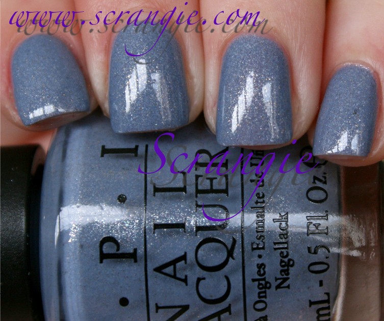 OPI I Don't Give A Rotterdam! This is a dusty slate blue base with chunky gold and silver shimmer. The shimmer looks really sharp and speckled against the creamy base.
  OPI I Have A Herring Problem. This is basically a warm version of I Don't Give A Rotterdam!. It has some teal and green tones in it, whereas Rotterdam has more of a periwinkle-slate cool colored base. The green tones in this bring out the gold shimmer particles nicely.
 OPI Kiss Me On My Tulips. A hot pink creme. Has a bit of blue undertone. Very pretty but I feel like I've seen this color a million times. It looks a bit like the Nicole shade All Kendall-ed Up that just came out for winter.
 OPI Pedal Faster Suzi! A very delicate light pink with some coarse silvery-white shimmer. The shimmer in this is like the shimmer in I Have a Herring Problem and I Don't Give A Rotterdam, but it's all silver, no gold. It looks crystalline and rough and very shiny.
  OPI Red Lights Ahead... Where? This is a very bright coral-red creme. We're seeing a lot of this color this season, aren't we? This and the bright Tangerine orange. I guess they are pretty close to the Pantone 2012 Color of the Year... And while you're looking at Pantone's color of the year, you should take a look at their Spring 2012 color trends. I think you'll find it interesting!
 OPI Thanks A WindMillion. This one is a dirty seafoam creme. Kinda like a mix between OPI Mermaid's Tears and OPI Stranger Tides. It looks calm.
 OPI Vampsterdam. Whoa... random! Doesn't this seem so out of place with the dusty pastels and the bright corals and oranges? This reminds me a lot of the colors OPI used to do back in the day. Rich color, very fine frosty shimmer, velvety finish. This one is a dark raisin color. Warm and with a touch of brown to it.
 OPI Wooden Shoe Like To Know? This is a chocolate brown with red-copper-gold duochrome shimmer. It looks like it has a tiny bit of purple to it in the bottle, but I can't really see the purple in it after it dries. This one also dries a lot darker than it looks in the bottle. The shimmer in it is very pretty, isn't it?
The formula on these was great. All of them were really smooth and even and didn't run or drip or bubble. The only one that gave me trouble was Pedal Faster Suzi! because it was sheerer than the other shades and it streaked. I did three coats of each shade and most of them needed all three. Dry time was great. The shimmers dry a little dull compared to the cremes, so be sure to remember your topcoat.
Overall, very nice collection. My favorite recent OPI Spring collection, right after India. Good balance of brights and soft shades. Nothing too sleepy or bland like some of the past Spring collections. What's really interesting about this collection is that there are a lot of familiar colors in it. It's like a mix of all the Spring collections we've seen so far. The orange, the coral, the speckled blue shimmers, the putty beige, the teal-green, the fiery purple shimmer... Do all the polish companies agree to do the same thing every year, or is there some kind of crazy corporate espionage going on each season? Either way, the colors are nice and the formula is perfect.
My picks are A Roll In The Hague, Did You 'ear About Van Gogh, Dutch 'Ya Just Love OPI?, and I Have A Herring Problem. Also, I think "I Have A Herring Problem" might just be my favorite OPI polish name ever now.
Holland Collection by OPI will be available February 8, 2012, at Professional Salons, including Beauty Brands, Beauty First, Chatters, Dillard’s, JCPenney, Pure Beauty, Regis, Trade Secret, and ULTA, for $8.50 ($9.95 CAN) suggested retail for each Nail Lacquer. For more information, please call 800-341-9999 or visit www.opi.com.
(This was sent for review.)
Monday, January 30, 2012
OPI Holland Collection for Spring/Summer 2012 Swatches and Review
Subscribe to:
Post Comments (Atom)


Your post is going to make me splurge on nail polish!
ReplyDeleteI really love the Dutch 'Ya Just Love OPI, Gouda Gouda Two Shoes, Wooden Shoe Like To Know... all the colors are actually really beautiful.
I spot some good ones. I really like red lights ahead after seeing your swatch
ReplyDeleteI want them ALL! Beautiful swatches as usual. I agree, I think this is one of OPI's strongest spring efforts in recent memory and in my opinion, a much-needed rebound after the "ehhh" Texas collection. I can't wait to get my hands on these!
ReplyDeleteI'm in love with your swatches of this collection, Scrangie! :)
ReplyDeleteOh my gosh, I Don't Give a Rotterdam! and I Have a Herring Problem are gorgeous.
The big surprise for me was OPI Red Lights Ahead...Where? I didn't expect to like it as much as I do! That shade looks especially hot on you!
I just love the blue one,the green one,the purple one that looks like Tru,and the pink one!
ReplyDeleteBeautiful swatches! The ones I want are dupes from the new Zoya collection, so I just have to decide what brand to go with. Probably OPI, only because it's easier for me to find in stores.
ReplyDeleteThe puns in this collection make me want to die less than most OPI collections!
ReplyDeleteI think I need A Roll in the Hague.
ReplyDeleteSince A Roll In The Hague and Deborah Lippmann's Lara's Theme are both Dutch oranges, which do you prefer? OPI's looks yellower and brighter (and half the price).
ReplyDeleteI really like Gouda Gouda Two Shoes, I Have A Herring Problem, and Red Lights Ahead... Where? (ha ha ha. This one reminds me a bit of MAC's Kid Orange, though).
This is a really nice collection. There are several that I want. There are several that do look like Zoya polishes.
ReplyDeleteDamnit. I think I'm going to have to purchase all of these.
ReplyDeleteDamnit. I think I'm going to have to purchase all of these >_<
ReplyDeletei can see a collection and not really want any but the second i see your swatches i want the whole dang collection! you make them all look so beautiful!
ReplyDeleteIt's a bit strange, eh? I was drooling over this collection ever since I saw promo pics looong time ago - I thoght it was gorgeous, then I saw early swatches long time ago, and then the new Zoya collection came out of nowhere, Essie did their spring collection and now we finally have OPI, and both Zoya and Essie were first to present their colors. But I think that OPI was first, I really saw the promo looooooooong time ago. I think sth is wrong here. All these dupes.. I dunno
ReplyDeleteI waited to buy any Zoyas Touch until these OPI's come out as months ago a blogger in Sweden had been given this collection for PR at the OPI Scandinavian conference/convention. Early on there were rumors the 2 collections were going to have some almost identical shades. My mind went right where your comment leads about what's this? Is there a deep mole in one of the companies spilling the goods to the other side? I know the fashion color picks are forecasted a long time in advance. But so often corps go outside of the box. I agree on Vamsterdam - gads it looks like a bad shade from old 1997 days. How did that one get in this collection? I bet it sits on shelves for a long time and is one many who bought 100's of each shade will get stuck with.
ReplyDeleteI really love these colors. I have a question. I have a UV nail light and I just found a gel topcoat that says it can be used over any nail polish. Have you tried this?
ReplyDeleteUgh, I want most of them! My wallet is crying. All the shimmers, and those bright cremes! Thanks for the beautiful swatches!
ReplyDeleteVery sad looking colors, and some just ugly: did you ear... and wooden you... I will skip the whole collection myself. I love OPI normally. :-/
ReplyDeleteThis is one gorgeous collection! My sister-in-law lives in Holland, so I just sent her the link. What fun colors, though I see a couple of Zoya dupes in there!
ReplyDeleteThis is pretty much awesome. I feel like I want nearly everything in this collection and that hasn't happened in ages... not just with OPI but with any company. :)
ReplyDelete"Someone" (hint, hint) needs to do a comparison with these and the new Zoyas. ;o
ReplyDeleteIt would be great to see Thanks A WindMillion side by side with Mermaid's Tears and Stranger Tides, too...
And oh how I love the names! Herring problem, tee hee. :)
I'm not too impressed by this collection but I do like the Vampsterdam and Roll In The Hague. I guess I'm just not one for muted colors.
ReplyDeleteI bought I Don't Give a Rotterdam last week and I can't stop wearing it! It's perfect.
ReplyDeleteI'm getting deja vu on some of these but the purple and blue I'll always be a sucker for!
ReplyDelete"Did You 'ear About Van Gogh?"....really? Was that the best van Gogh pun they could come up with? SHEESH. That said, I LOVE Vampsterdam.
ReplyDelete"Did You 'ear About Van Gogh?"...really? They couldn't think of a better way to reference van Gogh? SHEESH. That said, I LOVE Vampsterdam!
ReplyDeleteMy head reverberates with cognitive dissonance every time I look at Gouda Gouda, and realize that I am definitely going to buy this one, and love it.
ReplyDeleteMy head reverberates with cognitive dissonance every time I look at Gouda Gouda and admit that I am going to buy it, and love it.
ReplyDeleteI cannot wait for "I have a herring problem"
ReplyDeleteVampsterdam is a color i instantly love but it seems like so many of my other OPI polishes.
Great swatches. I think I need just three of those, but would like to see some comparison to older OPI collections
ReplyDeleteSome new polishes for my wishlist...Wooden shoe like to know is so interesting and I don't give a Rotterdam :). Love it.
ReplyDeleteAs a Dutchie myself I just need to have a few of these polishes!
ReplyDeleteToo many pretties. I'm gonna be so broke when this one hits!
ReplyDeleteGreat swatches!
ReplyDeleteI wonder what I Have A Herring Problem would look like with a matte topcoat on it.
ReplyDeleteRed lights Ahead looks comparable to China Glaze Make Some Noise...
ReplyDeleteI didn't need any but now i absolutely need 5 of them LOL..thanks!
ReplyDeleteI really like most of these, but some of them seem very dupeable. Do you think A Roll In the Hauge is similar to Essie Orange, it´s Obvious, and is Red Lights Ahead, Where similar to Essie Ole Caliente or China Glaze Make Some Noise? And Thanks a Windmillion looks a lot like Zoya Bevin I think. I think I will buy Kiss Me On My Tulips, Did You Ear About van Gogh, Dutch Ya Just Love OPI and Thanks A Windmillion. Maybe A Roll In The Hauge and Red Lights Ahead, Where? too. Many great colors here!
ReplyDeleteI'm interested to know about Ole Caliente vs. Red Lights as well. Both look bright and almost neon in these swatches but the Essie looks coral and dusty in someone else's swatch. As I have to buy these online and can't see them in person, it'd be good to know if anyone knows which is the brightest??
DeleteThey're definitely not neon (just the way my camera reacts to saturated red/coral/orange colors), but they are bright. The Essie is dustier than the OPI
DeleteThank you so much scrangie!!!!
ReplyDeleteYou are my beacon in the night expecially for new nail polish collection.... I think that a couple of colors seem too much similar to zoya true collection ones... But the others are quite good... I think I will buy some of them... See you soon!!!
I just can't get over the names. Hilarious.
ReplyDeleteWow, these colors are great! It's going to be hard to choose.
ReplyDeleteThanks for the swatches!
There are 6 of these I want, lol.
ReplyDeleteI really want Gouda Gouda Two Shoes... just because gouda is my fav cheese, LOL
I just got I have a Herring problem and did my nails after our Superbowl party. I love it. Obsessed. Can't wait to show it off <3
ReplyDeleteObsessed with I have a Herring problem. Love it, can't wait to show it off and add some gold glitter on top of a few nails <3
ReplyDeleteHow does Gouda Gouda Two Shoes compare to Essie Meet Balls? It looks like it could be similar
ReplyDeleteHow does Gouda Gouda Two Shoes compare to Essie Meet Balls? It looks like it could be similar
ReplyDeleteIt does look similar! My Essie Meet Balls is filed away somewhere and I don't know where it is.... but from memory, they look really close. Meet Balls might have more shimmer to it.
DeleteDo you have acrilic nails? How do they look so perfect??
ReplyDeleteAre your nails acrilic? How do they look so perfect??
ReplyDeleteI'm SO glad I looked up this collection on your website. I got a flyer from ULTA about this collection, but I wanted to double check with your website to see how they really looked. Did You 'Ear About Van Gogh? was so off on the flier. I thought it was white! Thank you for your blog. It's truly amazing, and I'm so glad I found it. I've shared it with all my friends, and I even mentioned it on my fatshion blog. Take care!
ReplyDeleteYou have the best nail polish blog! I always find here everything I m looking for!:-)
ReplyDeleteThat purple is killing me! Just gorgeous.
ReplyDeletethis was so helpful!
ReplyDeletebut it annoys me that you need to put three coats...
still, the colors are amazing!
thank you:)