Here's Barielle's collection for summer! Belly Dance. This is interesting- it's that taupey-mousy-putty color with a touch of purple that's been so popluar the past few years, but instead of being a creme as they usually are, this one has a little bit of very fine silvery shimmer. It's subtle shimmer, but it gives the polish a little something extra.
  Electric Boogie. Hell yeah!!! Shimmery deep blue with green glitter!! Thanks for making this, Barielle! Easily my favorite in the collection, though this polish does have one tiny flaw. It is very thick. You may need to add a little polish thinner to this to make it usable.
  Freestyle. A different take on this year's mint trend. This is a silvery, shimmery frosty pastel mint with tiny silver microglitter. You may have to enlarge the picture to see the glitter, but it's there and it's fairly abundant. Usually when you have a frosty polish plus glitter you end up with a chunky/lumpy end result, but this one works. The glitter is so fine that it seems to float in the polish instead of adhering to the nail and becoming lumpy, and the frosty base is sheer and light enough to allow the glitter to show through. So, what you get is a light ethereal green that sparkles like crazy.
 Night Moves. Silver foil. Super sparkly. Not as dense as say.... Zoya Trixie or Orly Dazzle.
  Slow Motion. Super light frosty metallic pink. It's not totally pink- it's a little silvery and just barely lavender toned. Now normally these types of colors send me screaming and running in the opposite direction, but when I was applying this one for this picture I couldn't help but think that this looked really clean and bright. It still looks that way to me... bright and clean and shiny.
 Passion Pirouette. This is a purple metallic frost. This one is pretty unique, too. I haven't seen many frosts in this particular shade. It's really rich, not faded or too soft looking. Metallic grapes!
The formula on these was okay. Electric Boogie gave me trouble because it was so much thicker than I'm used to, even from Barielle which tends to be on the thick side anyway. Like I mentioned above, you may need to thin yours. Other than that, these applied very well. I did three coats of all, most only needed two but Night Moves and Slow Motion needed three. Unfortunately, the drying time on this is very long. I was still denting Electric Boogie two hours later with Seche Vite. Maybe cause it was so thick? I haven't worn the other shades as full manicures yet, so I don't know.
This collection looks really retro to me. Judging from the names, I'm thinking that was the point. Kinda disco-like. Frosty. Sparkly. Luckily they aren't all frosts! Electric Boogie is gorgeous, I haven't seen a color like this since... since... Uh... When was the last time someone did a dark blue shimmer with glitter in it? Sephora Metallic Sapphire? I don't even remember, it's been a while!
(These were sent to me for review.)
Tuesday, April 20, 2010
Barielle High Steppin' Collection for Summer 2010
Monday, April 19, 2010

Wednesday, April 14, 2010
Nubar Fortress Collection Spring 2010
These have been out for a little while now so there's nothing brand new to see, but more pictures of polish are better than fewer, right? Hehe.
A surprising and unexpected set, if I do say so myself. I love the names of these! Barricade. A medium-light grey creme. Not as much of a blue undertone in this one. I think this is the one that looks best against my skintone as well. Also reminds me of trying to get the Lantern Shield to drop.
 Citadel. A light grey creme. Little bit blue toned. All these fortress-themed names... love them. This one reminds me of accidentally killing half the people in Garlaige Citadel while waiting for the gate to open. Oops.
  Dark Castle. Nice black shimmer! Looks like black leather to me. Also a little bit of a blueish undertone.
  Knight's Armor. Black base with silver glitter. This is the one I was most interested in from the promo pics but it's not as cool as I'd anticipated. I mean, it looks cool, but it's kinda... dull? The glitter doesn't sparkle. It's a little hard to apply smoothly and looks kinda lumpy when it dries. It looks much better matte than shiny, but I forgot to snap a picture of it with matte topcoat.
  Marble Tower. Very light grey with strong blue undertone. It is somewhat similar to Citadel but Citadel is more neutral and this is more cool. Different light greys for different skin tones.
 Palisade. Medium grey creme with strong blue undertone. This is a little bit like Rescue Beauty Lounge Stormy, if I recall correctly. I haven't compared them side-by-side, I'm just basing that on memory. This is a good alternative if you don't want to shell out $18 for a grey creme, the formula on this is actually pretty damn good despite it being half the price.
 Silver Sword. A metallic charcoal-silver frost. Be careful with your brush strokes when applying this because they do stay fairly visible after the polish has dried. As long as you do straight, even sweeps with the brush you shouldn't have a problem.
  Stronghold. Once they win, once they drop their guard, we will hit them, we will hit them hard... Totally one of my favorite songs for working out. Anyway. Dark grey creme with slight blue undertone. This one most reminds me of Obsessive Compulsive Cosmetics Dangerous, but this is a little lighter. Shark grey! Very nice, this one is my second favorite.
The formula on these was mostly excellent. The cremes were all very opaque and dense and applied flawlessly. The only ones that gave me trouble were Knight's Armor because it's so thick and kinda lumpy and Silver Sword which had a kinda strange airy texture. Silver Sword didn't apply badly, really, it' s just that it has such an odd texture, like... whipped polish or maybe like syrup? The other thing about these is that the cremes dry pretty dull. You will need a topcoat if you want them to be nice and shiny. Drying time was great, everything else was super. Nubar's new formula is really nice to use, it seems like they've made their shades lots more opaque then when I first started using Nubar.
This is a really weird collection if you think about it in the 'new seasonal collection' sense- I mean... eight greys for spring? But I see this less as a seasonal collection and more as filling out the gaps in their permanent collection. Cause... they didn't have many greys at all in their line... And now they have a grey for everyone. Lots of choices. Looks like they're really broadening their color variety this year! They've also done the same thing with reds, which I'll review shortly.
Overall, I dig this collection. I adore grey cremes even though I know they rarely look good on me. They're just so effortlessly cool and put-together looking. Grey creme is powerful. The formula on these was great, so I think I'll be putting a lot of these into my regular rotation. The only thing this collection seems like it's missing to me is the rare grey-tinged white. You know, that sort of super light grey shade? Like white with a little smoke to it. I would have liked one of those.
I'm noticing a trend now- Nubar frequently does monochrome collections. Purples, corals, greens, browns, greys, reds.... I'm dying to know what's next. Blues? I hope it's blues!!
(These were sent to me for review)
Tuesday, April 13, 2010
Grossest Polish Ever
I recently swatched what has got to be the grossest polish I have swatched to date.
I bought it last winter because it looked so pretty, but then I forgot all about it and never wore it.
The color is really beautiful in the bottle- a pale icy blue with a smattering of opalescent glitter. A snowy, sparkly, perfect winter color adorably housed inside a snowman's head.
Unfortunately, it just does not work on the nails. It dries to a chalky matte finish with huge lumps and chunks because the glitter is covered in polish and can't shine through the chalky base. It looks like cottage cheese. If I walked into the hospital wearing this I'm sure they'd write me a prescription.
I mean... this is so gross and chunky that you can still see the chunks even with two coats of topcoat. The funny thing is, this polish looks better in the picture than it does in real life. Usually it's the complete opposite- polish looks better in real life than in the pictures. My pictures usually tend to show me flaws that I don't notice in real life as well, but in this case it seems to hide the flaws that are glaringly obvious in real life. Must be all the topcoat.
It makes me wonder how a polish that looks so incredible in the bottle ends up being so gross on the nail. It's like they didn't even test this before they mass produced it. It doesn't even have a name! It's a crying shame cause the color in the bottle is positively magical.
I normally love the Snowman polishes that come out every year. My absolute favorite is that red and green fine glitter Snowman. And you know.... they used to have cute little top hats for lids but now all they have is a weird black pole coming out of their head.
So far that's the only dud snowman in my collection. All the other ones are amazing. Fingers crossed this year's set...
Monday, April 12, 2010
Urban Decay Summer Of Love Mini Nail Kit for Summer 2010
I really wanted to swatch these the minute I got them, but I've been too sick to swatch and it's been TORTURE!! Ahh!! But I was finally feeling well enough to swatch and as usual my impressions of the polishes changed between looking at them in the bottle and wearing them on my nails.
It's a set of minis and it comes in a snazzy looking zip pouch like the last mini set did. Aquarius. A sparkly near-metallic aqua blue. It has a subtle amount of greenish reflection to it. This one applied a lot more sheer than I thought it would; you can see a little visible nail line on me.
 Hashbury. I had originally picked this one out as my favorite. It's actually much more red toned on the nail than it is in the bottle, as you can see in this picture. On the nail it's not as purple as I thought- it's actually more of a dark magenta with blue shimmer. Pretty but unexpected!
 Love Light. This turned out to be my real favorite. I know, crazy, right? But I can't help it, it's so pretty. It's a sheer slightly peach-tinted shimmer. The perfect summer nude/neutral for my skintone, but I can see this looking amazing on someone with a tan or someone with a very dark complexion. It's so sparkly. Not boring at all. It reminds me of what I like about OPI Princesses Rule!- yeah, it's a soft shade but it's just too pretty not to love.
 Magic Bus. Saturated orange creme. I thought this one would be neon but it's not quite. Indoors it looks like a dark retro orange, outdoors it takes on more brightness but it's still not fluorescent. It is bold and colorful and it reminds me more of summer than fall, which is unusual for orange cause they always remind me of pumpkins.
 Psychedelic Sister. Nothing really exciting or unique here- it's your standard summer coral creme. Not ugly, but not too interesting either. It's neither exceptionally bright nor super dramatic, it's a little muted, middle-toned, soft looking.
 Shine On. Another typical summer shade that would look great on someone with a tan. It's a light sandy bronze, lots of fine shimmer, borderline frosty but really more metallic than frost.
  Woodstock. Neon pink creme. How hot is this? I think it's hot. I love these neon pinks, they're so eye-catching (or is that eye-burning?) and fun.
The formula on these was good! The last set was a little inconsistent in terms of texture, but these are very uniform. They all went on smoothly and didn't give me any difficulty at all. Some of the shimmers were a little on the sheer side but all the cremes were very opaque. I did three coats of everything, but the cremes only needed two. One thing worth mentioning- they have a wide-ish brush. Not Pro Wide wide, but nice and substantial. I was able to get one stroke coverage with it and that's a huge bonus for me. Normally mini polishes tend to have mini brushes that I find hard to use, but these were fantastic. They were all even and just soft enough and they fanned out perfectly. Great brushes.
Overall, I love the idea of this collection. The 'Summer of Love' 60's psychedelic theme. I was not alive in the 60's but all of these colors together in a set do evoke images of 60's-70's fashion in my mind. I'm seeing a lot of long hair, a lot of flowers.
I do love the colors as well, I think they're really fun and flattering, but I can't say that any of them are one-of-a-kind or super unique. I don't have too many colors like Hashbury or Love Light in my collection, so I'd call those the most unique of the set.
But... this does open up lots of possibilities... Urban Decay has now done TWO sets of polish. It wasn't just a one time thing last fall. That gives me hope that maybe... maybe... one day they'll re-release a lot of their classic colors. How awesome would that be? They could do a set- even a mini set if that's what they had to do- of all the good old Urban Decay polish shades... maybe Bruise, Toxin, Id, all the super unique amazing ones that no one has managed to copy yet. Man, I'm getting myself all excited at the idea. I really hope they do something like that. I would freak out.
If you're interested in picking these up (or last fall's Apocalyptic kit), Urban Decay is doing their Friends and Family sale right now so you could get them 30% off. The code is 1SFNF and I believe it's good until the 19th? Next week at least.
(These were sent to me for review)
Sunday, April 11, 2010
Absolutely not nail related...

(See, Karen? I did it! XD)
I could make some wisecrack about Olli being welcome to komm in mein Boot or something like that, but I think I'll just leave it at the fangirl-esque collage. Heh...
And now back to your regularly scheduled programming.
Saturday, April 10, 2010
Essie Resort Collection Summer 2010
This is Essie's first official offering for Summer 2010 and I must say.... I'm quite pleased! Take a look. Lapis of Luxury. This one didn't quite photograph accurately- this is really a softer shade of blue. My camera wants to make blue cremes look super bright, but this is actually more what I'd consider periwinkle than sky blue. It is beautiful. Supremely beautiful. A soft, serene blue. Love at first sight for me. Very soothing to look at, isn't it?
 Playa Del Platinum. I didn't expect this to be this color! Based on the promo pic and the name, I just kinda assumed it would be silver. I like it better this way! It's a mousy grey with maybe a little hint of warmth. Nice and soft and gentle looking.
  Splash of Grenadine. I actually like this. A pink that I like. I like it because it's unique and interesting. My photo doesn't really capture it, but this is a really soft color, almost dusty looking. It's mostly pink but there's a touch of red-purple to it that keeps it from being baby pink. Despite how soft the color is (and it's not pastel either) it really stands out against my skintone, so it's like a soft-bright, fun! It's not really the color of grenadine but I'm thinking it's more a play on words- grenadine islands, grenadine is red and used in drinks....
 Turquoise & Caicos. I'll admit, I had to look up 'Caicos'. Now that I know it's a group (or groups?) of islands in the West Indies, the name makes sense to me. Anyway, the color is great. It's not mint green... it's not jade green... it's not For Audrey. It's a perfect turquoise, a light blue mixed with bright green. Very lovely.
The formula on these is the only drawback to this gorgeous collection. I found it quite tricky to apply. The combination of runny polish and small brush gave me a little trouble with streaking and all four shades needed three coats to compensate. However, drying time was great and three coats dried in no time. They all dried to a highly glossy finish, which is a bonus if you're one of those people who never uses topcoat.
Small collection but good. Nice pretty blues that I will definitely be wearing regularly and a pink that actually looks good on me instead of giving me dirty-looking hands. I was half expecting neons again, and I like neons, Essie's especially, but I'm really happy they did blue and turquoise instead! I just got a vision of a Konad design... Playa Del Platinum with a scrollwork pattern of Turquoise & Caicos on top... now I have to try it.... Hmm...
(These were sent to me for review.)
Friday, April 9, 2010
More random swatches: China Glaze Edition!
YAY!
Here's a little bit of my China Glaze collection. They've done a lot of amazing colors over the years, and I'm really glad their new formula dries quickly now cause they're one of the most ballsy and creative brands when it comes to color. In The Mood something to Green.... Might be Gold to Green? It's supposed to change colors but I've never been able to get it to change. That's totally okay cause I love the color it is right now!
 Cross Iron 360. Man, the Ski collection was great. Every single color was amazing. This one is a flaming copper-orange with really cool shimmer that lights up like flames and a little bit of duochrome.
 Crown Jewels. I think this is an older one and I can't remember ever wearing it other than to swatch it here. It's a light frosty purple.
 Crystal Ball. Tell me, tell me where I'm going, I don't know where I've been... Tell me, tell me, won't you tell me and then tell me again... My heart is breaking, my body's aching and I don't know where to go.... Tell me, tell me won't you tell me, I just gotta know.... Crystal baaaaaaaaaaaaalllll! So many things I need to know! >.>;;
 Dripping In Gold. Basic light gold frost/shimmer. Shimmery frost. I think there's a bit of gold microglitter in here too but it's not super visible.
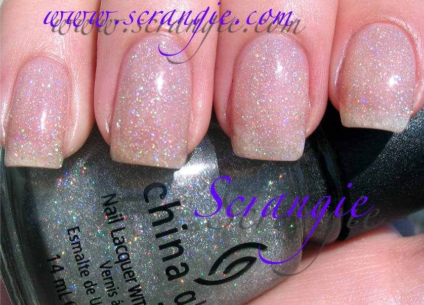 Fairy Dust. Definitely not meant to be worn alone. I think this is like... 5 coats or something. Hahaha!
 Gilded Treasures. Aw man, I see polish residue from the previous color under my pinkie and a giant globby smudge on my index. And my nails are all different shapes and lengths. No wonder I never posted this picture. Great color, though, sparkly microglittery light gold.
 Golden Glamour. I don't know if I like this nail shape on me.
 Hippie Chic. Old picture!! I do have a thumb! And uneven broken nails! But again, awesome color. Rosy red and pink with gold shimmer and duochrome.
 Grape Crush. Mmm, holo glitter.
 Frostbite. Scrangie tested, Abbath approved!
 Yell-O-Neil. I like the color of this one but the formula was a nightmare. Really thick and glue-like. Needs thinner.
 I'm Not Bitter. I think I must have broken at least two nails the day I was doing these swatches. The pinkie and index are really short and rounded, a shape I never do on purpose unless a nail broke in the corner. Huh. Why do I swatch with broken nails??
 Ink. The Ink collection was SO GOOD. Was this 2008? 2008 was a great year for China Glaze collections. This was the nail art polish that came out in that collection. It has a teeny tiny skinny brush for doing nail art and it was a serious pain in the ass to paint my nails with it! Haha! But it 's a unique color, dark blue almost black. Creme finish.
 Limonyte. So amazing. Again with the broken nails, though! China Glaze, for some reason, has discontinued this incredible unique neon green. They seriously need to bring this back!! One of my top three neon greens of all time! I haven't found an exact match for it in any other brand!
Thursday, April 8, 2010
Weird rambling mush and a buncha random Orly swatches
First off, I want to thank you all for all the kind words. I really do feel sad or like I'm letting people down when I can't post frequently or answer emails in a timely manner. I've gotten so much positive feedback over the years of blogging from messages telling me how much people like my pictures or how much my pictures help them with their polish choices, and it's been surreal and awesome to meet so many other people who love makeup and polish like I do.
The downside to that is that when I can't post as often as I want to, I feel like I'm not helping anymore, you know what I mean? I feel like when I'm just posting about random crap I like that it isn't helping anyone, like posting pictures of some old polish from 1997 that I love but no one can buy it anymore. I'm just trying to find balance, I think. One, to manage my time more responsibly (cause as much as I love it, this is a huuuuuge time vampire and I spend countless hours taking pictures of my own hands... productive, right?) and two, to not feel bad about posting random stuff I like on my own blog even though I know I'll get a bajillion emails saying "Where can I buy this??? Why do you post discontinued colors, you're a tease!!"
I really do love writing my blog, I love taking pictures of polish and recording my thoughts about it. And I really love the idea that somehow my blog helps someone halfway across the world find a new favorite polish. That's really cool. So, thank you for the support and all the good times. I'm not going anywhere!
So, yeah, I don't mean to get all weird and mushy and stuff... And now I feel all awkward and don't know how to transition into the rest of the post.... ummm.... uhh.... Look what my brother did to my Venus Flytrap! I don't think it really likes Caramel Apple flavored candy corn.
And now polish swatches!
You probably remember me talking about swatching my Orly collection a few months back. I made a lot of progress in spite of the complete lack of sunlight. I have a pretty big Orly collection that I have a love-hate relationship with. I love them cause they used to have tons of cool colors but I hate them because they take seventy-two years to dry. Amethyst Decadence. Really cool looking polish. Sheer purple with silver flecks. I forget how many coats this was but I think it was four.
 Buried Treasure. Frosty bronzy-brownish metallic. Kind of an old-fashioned 80's-90's color.
 Fantasea. Quite honestly one of the best colors Orly has ever done. It has that 230-like red-pink-purple-gold iridescence that I love to see in polish. A little bit like OPI... Merryberry Mauve? One of those. Super awesome.
 Ginger Lily. Truthfully, I only bought this for the name. Why for the name? You'd have to know me personally to know that :)
 Cut The Cake. Blurry picture, cool polish. I don't normally go for the 'bridal collection' type polishes but this one is super pretty. It's sheer but it's made of little white-iridescent flecks of shimmer and they subtly change color with the angle.
 Dazzle. I think this might be the third picture I've posted of this and I still can't get a good shot of it. It's your standard silver foil, but seems to have a little extra silver microglitter kick to it.
 Flagstone Rush. Autumn! Changing leaves! The 90's! Brown lipstick!
 Glam. A girl on the nail board made me fall in love with this. It's so hard to photograph. It's a deep wine red with silver glitter. Unique and hot. I always think of that girl when I wear this! Same with Essie Cloud 9.
 Gogo. Pain in the ass to apply but a super hot color. Pure soft white with little bits of shimmer and silver glitter. You probably can't see the silver glitter in this picture, but it is in there. Very appropriate name, too, it makes me think of Go-Go boots.
 Goth. Have I posted this before? I don't remember. Black with irregular silver glitter. One of my favorite black/silver combinations cause the glitter is all different sizes.
 Hot House Flower. One of my most worn Orlys. Neon orange/coral with pink/violet iridescence. Picture doesn't do it justice.
 Jungle Love. Ooh, old one, bonus! Why don't they make them like this anymore? This reminds me of an old Nat Robbins cream-to-powder eyeshadow I used to wear in high school. It's exactly the same color. I accidentally left it at Jill's house at a sleepover so I had to go everywhere looking for a new one. It creased like mad, it was horrible, but I wore the hell out of that shadow.
 La Vida Loca. Another of my most-worn Orlys. Neon fuchsia with blue/violet iridescence.
 Livewire. Super hot but one of the worst staining polishes EVER. I had neon yellow nails for a week after I wore this. It's barely-neon yellow with golden iridescent shimmer. Takes 3-4 coats and never dries but I love it so much.
I'll post more of my Orly collection sometime. That was fun.


