I feel like posting some massive Illamasqua spam. They stole my heart the minute I saw their products and have easily made my top five favorite brands.... Awesome colors... awesome name... formula like liquid glass... *dreamy sigh* I'm in an Illamasqua mood right now.
I might have posted some of these before, I can't remember. Boo! Amazing purple, blue, pink and gold-ish multi glitter. Looks a bajillion times less blue in real life. More purple. Purple glitter. It's not a match to any of the recent purple-pink-blue glitter combination polishes as far as I can tell. This is unique- the glitter is teeny tiny and pretty sparse. Very sparkly, though. Possibly better for layering- this is four coats.
 Boo over Sally Hansen Purple Heart. These Halloween ones (Boo and Hiss) were meant to be paired with Baptiste and Boosh for layering. I didn't have either at the time I took these pictures so I grabbed the nearest purple shimmer and tried layering. Looks awesome. Looks even better over black, I think. I don't have a picture of that, though.
  Hiss! I don't have another glitter like this! It's gold based with really flashy pieces of hot pink and more subtle dark purple, blue and yellowy looking particles. The pink and gold seem dominant on me. Again, über sparkly, flashy, colorful but a bit sparse. Four coats pictured here.
 Hiss over Wet n Wild Black. One coat over black looks pretty dense, doesn't it? But it doesn't seems as dense alone. Maybe I need to shake better next time. I love this even more over black. The glitter stays crisp and shiny looking.
 Caress. Pastel baby blue creme. Love this. I had a polish like this in the 90s I use to love. Might have been a Hard Candy... Memory fails me. But yep, not too many other ways I can describe this other than stark creamy baby blue. Caress and Wink (below) were from the 2010 Spring collection.
 Wink. This picture didn't come out so good. Hm. It's a pale lilac creme. Very white-based. Not as blue in real life. Pretty and delicate yet edgy because of the stark white crisp obviousness of it.
 Force. AHHHH!!!! How hot is this?! It's super bold crayola blue. It's rich and pigmented and can change looks depending on the lighting. Here in the sunlight it looks almost neon bright, but indoors it tones down to a saturated and slightly darker looking blue. I layered Sally Hansen Hidden Treasure over this and it was one of the coolest flaky-layering combos I've ever done, couldn't stop looking at it. The girl at the museum with the chipped off gold glitter polish even raved over it when she was putting on my wristband! (Force, Jo'Mina and Prism are all from the current Summer 2010 collection- Body Electrics)
 Jo'Mina (direct sunlight, outdoors)
 Jo'Mina (ambient natural light, indoors). I am really upset about this one. Not about the polish, but about the pictures. I've been holding off on posting the Body Electrics collection because I couldn't get a good picture of this. It is extremely beautiful and it deserves an accurate representation. I'm failing to achieve that, so... Picture it less blue (getting tired of me saying that yet?), more red toned, more saturated and very IN YOUR FACE VIBRANT PURPLE!! It seems so much like a pastel here...it is light but I wouldn't call it a pastel... but in real life it's just so electric looking! I can't even describe it. Glowy light purple. I've never seen another polish like it.
 Prism. Sheer white pearl with super strong blue iridescence/duochrome and subtle pink/green duochrome. Like mother of pearl. Also reminds me of a polish I had in the 90s. The 90s were a good time for polish. So much cool stuff back then. But... this is now and Prism is right here on the screen so I guess I should get back on topic... Prism seemed like it would be really sheer, but it's not really. First coat is very sheer but it builds nicely. I like the way it looks alone and I have worn it alone. This is three coats, you can see visible nail line but not too bad. I do four when I wear it.
 Prism over Force. No words. Too pretty.
 Prism over Jo'Mina. It accentuates the purple-ness of it and some of the duochrome shows green. Love.
 Collide. Now this is what it's like when worlds collide.... Yes. When worlds collide, they become neon pink.
 Grab. Interesting bright fuchsia-pink. Really rich looking. Purple toned. Creamy.
 Hectic. Have I posted this one? I swear I've posted this one. It's amazing. Murky olive green. Right up my alley. Perfection.
 DWS. This one was a surprise gift from a buddy and it quickly became my favorite light grey. It goes really well with my skintone. Applies like butter. Very glossy.
 Whack. Really glowy bright jelly-ish almost neon orange. Very noticeable. Maybe a little bit of a red tomato or coral undertone to this. Mainly orange. Extremely loud orange.
 Propaganda. Super dark blue jelly. A little bit like NARS Midnight Express. I made a huge mess when applying this one. It was comedic. I knocked over my bottle of remover and it covered my entire kitchen table. Went on the floor. Melted my pen. Only messed up the mani a little bit!
 Smash. HULK SMASH!!!!!! I wanna say that when I wear this. Another kickass green from Illamasqua. There's nothing I don't like about this. I especially like the name... Head over heels I've fit in before... Now I don't want to do it no more... I just want to be who I want to be... Guess that's hard for others to see... (That was kinda the theme song of my life for a while!)
 Strike. Metallic aqua blue. A little frosty, actually. Sparkly and frosty. And blue.
 Baptiste. Last but not least... Baptiste. I made a rhyme! I can't think of anything to say about this polish. It leaves me speechless. It's so pretty. Almost too pretty. Iridescent shimmery vampy multidimensional purple. *drool*
Can't wait to see what colors Illamasqua will do next. Hopefully they'll do more of those incredible glitters for Halloween... Only four months away... I'm crossing my fingers!
(This post contains items that were sent to me for review.)
Wednesday, June 16, 2010
Illamasqua Spam

Tuesday, June 15, 2010
Nina Ultra Pro Purple Xing

 Nina Ultra Pro in Purple Xing. Top is natural light (indoors), bottom is flash to show the hologram glitter. I don't think I've posted anything from my Nina stash yet! So, why not start out with the best one?
I love this polish. It combines two of my favorite things: purple and holo glitter. I think it looks amazing. It's a little sheer but I think it's worth it to do the three or four coats it needs. The name had me confused when I bought it... I'm like... what is this? Xing? Kissing? Crossing? X-ing? And then it sorta dawned on me- maybe it's supposed to be "perplexing"? I love polishes with crazy names.
Nina has some pretty cool polishes, I think I need to try more of them. The colors never wow me on the display but when I pick up the bottles and examine them I usually find some cool detail I like about each color. The bottles don't really jump out at me, I'm a sucker for nice packaging and I suppose my eyes just glance over the plain generic round bottle. Reminds me of the Seche bottle or the old Sinful bottle.
I think they should do more colors like this- a blue one, a green one, heck, I'd really like to see a yellow jelly with holo glitter. Jelly + holo = awesoooooomeeeeeeeeee
Konad Code
Since I can't get my editor thingie to load so I can add it to the sidebar, I figured I'd post a quick note here until I can add it permanently.
Konad has approved free shipping codes! No word in if we'll ever see discount codes again, though. :(
So, to get free domestic Priority shipping on orders over $20 from OCNailArt.com, enter 'scrangie' at checkout and select priority shipping.
Thursday, June 10, 2010
BB Couture Regular Guys, Tools for Men and Mechanics 101
Making progress on my backlog! Yes! Three collections in one post! All are from the BB Couture Men's line, 2009 and 2010. Awesome!!
 Blue Collar. Sky blue/baby blue with silver metallic shimmer. Reminds me of nail polish from the 90s. Actually, a lot of things in this line remind me of the 90s- which is a plus in my book! This color is really cool looking, soft with an edge. If it takes all night to be just who I am... Well I'm gonna be a blue collar man...
 Bullfighter. Deep bloody red jelly with shimmer. This one changes color depending on how many coats you do. It's lighter and brighter with one coat and deepens to this red/maroon color with three coats (I have three in this picture). Jelly shimmer is a really cool effect. Looks deep.
 Coal Miner. In the year of 98, the mining trust became our fate... The weight of work now breaks the backs of the dirty black leg miners... I love when a polish reminds me of a song. Especially one of my favorites. Anyway. Coal Miner is a dusty blue charcoal type of color in the base with a speckled blue shimmer on top. Very unique and I'm quite fond of it.
 Cowboy. This one also reminds me of a song, but it's a song I really really hate! Also reminds me of another song that I like more.. You see us comin' and you all together run for cover.. We're takin' over this town! Man, everything reminds me of a song. But about the polish. It's suede colored. A soft suedey taupey brown with secret shimmer.
 Golf Pro. This one looks like it could be Kelly's Green's brother! A muted dusty jadey green with silver shimmer and black microglitter. You may need to enlarge to see the black glitter, but it's there.
 Mariner. Really frosty dusty evergreen color. A deep green with tons of silver frost. I'm not sure how I feel about this one. I alternate between liking it and being disappointed by it. I like it better in sunlight than indoors, indoors it looks dull and dusty.
 Drive Shaft. Hehehe.... Shaft. *ahem* This is a really unusual pick for a men's collection. Sort of a peachy-coppery-mauvey frost. A little dated looking. Not my favorite of the collection. Wish I had more to say about it! Frosts just aren't my thing.
 Fuel Injector. Fuel injection makes you high... (Maybe I shouldn't listen to my iPod when I write reviews.) This color is AMAZING!! Vibrant grassy, leafy yellowy green with tons of gold shimmer. This is what I love about BB Couture. Millions (okay, maybe... dozens?) of awesome kickass greens.
 Stick Shift. ... And safety belts? Bucket seats have all got to go. Seriously, I'm on a roll now. I wonder if they do this on purpose to get songs stuck in my head? Oh yeah, the polish. Everything about this polish is love. It reminds me of this guy I had a crush on in like... 3rd grade. He used to wear shorts this color. It's a murky mustardy yellow with a crazy weird pink flash. This polish makes me happy.
 Shock Absorber. Okay, this one doesn't remind me of a song. Lucky you. But it is a light rusty red coppery fall-ish shade. Frosty, though. Really frosty.
 Intake Valve. A chameleon color! It changes on me depending on the lighting. In some lights it's grey, sometimes it looks lavender and indoors it looks like straight greyed-out pink. It has some hidden shimmer to it. Unique for sure. Pretty fun to look at as well. Two thumbs up.
 Universal Joint. Oooooh neato. Duochromeish swampy green with gold shimmer and faint pinkish shimmer. Love these BB greens. The name makes me laugh though, sounds like it could be the name of some sort of hippie jam band.
 Vise. Deep dusty blue with silvery bluey shimmer. Sometimes looks a little duochromey because of the dense shimmer (the shimmer is dominant at some angles, at others the base is) but I can't call it a true duochrome.
 Studfinder. This one morphs on me as well. In sunlight it looks like straight neutral brown with silvery shimmer and indoors it looks like a dusty plum-brown with gold shimmer. Weirdness! Cool color, though. Goes along with Cowboy in the soft-suede department.
 Hammer Drill. It's frosty... Frosty frosty frost... however... I think I like it. It reminds me of fall. It's maroon-brown-red-chestnut-plum frost. Sometimes it looks redder, sometimes it looks browner. I think sunlight really pulls out different tones in these polishes.
 Wire Stripper. I think I posted this one before with a Konad design on top. Another fascinating color to look at- it looks black sometimes, but I think it's mostly a deep grey with heavy brown tones. Or.... maybe it's just dark brown with dustiness? It's brownish-greyish with lots of silver, gold and red shimmer.
 Pipe Bender. A deep bluey-green base with a crazy purple-navy frosty shimmer flash. Totally unique. The duochrome/blue flash acts really strange in this one. It's like you can see both colors all the time... they compete with each other... Green! Blue! It's pretty sweet. And it makes me wanna yell, "Bite my shiny metal ass!"
 Impact Driver. Slate blue with microglitter and shimmer. It's muted and greyed looking, on my skintone it looks blue but I've seen a few pictures where it looks grey on others. The shimmer is really pretty in this. It's a very subtle soft color.
The formula on all of these was great. Standard BB Couture formula with no deviations. Which means... a little bit thick (but not as thick as something like Barielle for comparison) but perfect application. Three coats of all. Good pigmentation, a lot needed only two coats, but three coats deepens and enhances all the neat effects in the finishes of these. Dry time on these is actually faster than the 'regular' (non-men's) BB Coutures I have. Maybe it's my imagination... but with these I can paint and topcoat and be ready to go in five minutes. Anyone else experience faster dry time with the Couture For Men line, or is it just me?
Wow. What do I even say about these? First, I love them. I love unusual unique colors and that's just what these are. Only maybe two or three polishes out of all three collections that I didn't care for. Heavy on the greens. Lots of flash and soft duochrome. Glitter. Interesting finishes. I don't think I have anything negative to say about these. Well... okay. I can think of something. Why so much frost?? BB Sure loves their frosts. But... they also love their glitters and their green polishes so I shouldn't complain! No one else does anywhere near as many greens and glitters.
And I know these are marketed for men- which I think is awesome- but of course women can wear them to. And vice versa... No reason a man can't wear a polish marketed for women. It's just colored paint.
OH!! That totally reminded me! I went to a wedding last Friday (wore some killer hot shoes too) and there was a boy there WEARING NAIL POLISH!!! It was just black nail polish, but still... it made me happy. It was well done, too- no polish on the cuticles and no chipped tips. Right on, dude.
Before I click 'publish' I thought I should say (cause I get asked every time I post BB)- you can buy BB Couture For Nails at overallbeauty.com or bbcouture.com . I have never seen them in stores, and I don't think they are actually in any retail locations. Correct me if I'm wrong though! I'm under the impression they're online only.
(These were sent to me for review)
Doppelgänger
I met my doppelgänger at the doctor's office yesterday. It was freaky and awesome. She was about my height, had purple hair, was wearing purple eyeshadow, black clothes, green nail polish and the same toe ring as me!
I was too chicken to say anything but it was really exciting. I wonder if she was thinking the same thing I was?
I love purple eyeshadow. This is from a couple months ago and I don't really remember what I used. Looks kinda iridescent... Maybe MAC Stars n Rockets? I know it's Urban Decay Liquid Liner in Minx for sure, but I can't quite recall what else.
Eyeko Fall 2009 and Spring 2010
I know, again I'm way behind on these. For the 2009 ones at least I was hoping to re-do them because my pictures didn't turn out... but... I already photographed em, so I might as well post them!
These pictures were taken indoors on a dark, gloomy, windy fall day...
 Cosmic Polish. For Space Age nails! My favorite of all of Eyeko's polishes. It's a black creme base with lots of tiny holographic glitter particles. I took a picture with flash to show the hologram effect of the glitter. Rainbow colors! It's subtle, definitely not in-your-face glitter or holo, but it adds a nice sparkle to a glossy black manicure.
 Indigo Polish. Dark blue shimmer. Pretty straightforward. Not as dark as MAC Naughty Nautical or OPI Yoga-Ta Get This Blue.
 Lilac Polish. I wish I could have captured this better. It looks so blue here! It's really less blue, more.. well... lilac.
 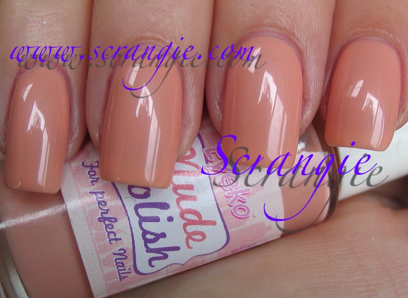 Nude Polish. This is sort of a deep peach or maybe a cafe au lait with a hint of orange. Very warm. Very peachy.
 Purple Polish. A neon purple- dries matte. Reminds me a whole lot of Milani Rad Purple. Sadly, this polish had one of the worst formulas I'd ever used. It was so thick I could barely apply it and it wouldn't flow nicely on the nail. It was like painting my nails with melted American cheese. O_o
 Vintage Polish. This is a bluey-green creme. Turquoise, perhaps. It looks a little more blue in my picture than it does to me in real life. It's actually really beautiful, it is more saturated than most of the jades/mints in my collection.
And that's it for the 2009 ones. Can't believe it's taken me this long to post them. I think I should do a quick formula review of these before I get to the 2010 set. Some of these were extremely thick. Cosmic Polish was the thinnest and easiest to use. The rest were thick and three-free-ish (runny yet thick and gloopy). I did three coats of all. I really can't say I enjoyed the formula on these. I would recommend picking up some polish thinner if you plan on getting these because it will really help the application.
Now, 2010! Coral Polish (for resort nails!). This is hot. Super flashy red-coral creme. I have grown fond of these flashy-bright reds (er, corals) over the years. This one is softer and less saturated than Rescue Beauty Lounge Bangin' but still has a similar feel.
 Petite Polish. Pale pink sheer creme. Kinda cutesy, don't you think? Very frilly. But what is it with pastel pinks and being thick as glue? This one was so hard to apply! Thick and streaky.
 Posh Polish. I. Love. This. Holy crap do I ever love this. It's like.... milk chocolate with dust mixed in! Or... mousy taupe! I love these kinda colors. This one seems more brown than a lot of the other ones I have, but it's more grey than OPI Over The Taupe. Is this what Chanel Particuliere looks like?
 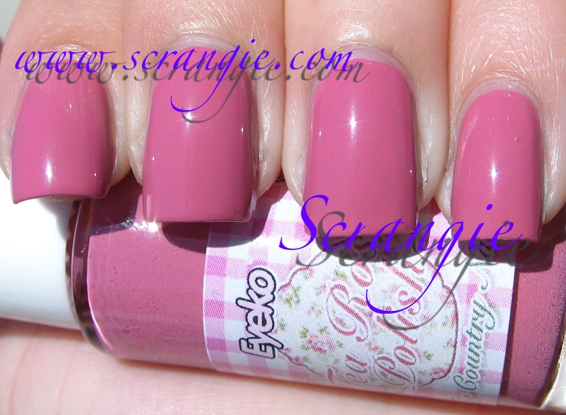 Tea Rose Polish. Interesting color choice. I suppose it goes well with the muted color scheme of Posh Polish. I love the label on the bottle and I like the whole idea of this polish, but I can't get over the fact that this is such a... umm... mature shade of polish.
  Vampira Polish. Ooh, sexy! Black creme base with sparkly red glitter! Love how it looks, love the gothiness of it. It is pretty much the same as China Glaze Lubu Heels / Piggy Polish Midnight Fireflies / Milani Garnet Gem, though.
The formula on these was definitely improved over the 2009 releases. The only one of these that was too thick was the Petite Polish. Vampira Polish was actually a bit watery! I did three coats of all, but only Petite and Vampira needed the third coat. Pigmentation is pretty nice on these. The bottle shape does make application a little tricky, though. It's really easy to knock over this tall thin bottle. Some of the brushes had defects, such as uneven alignment (slanted brush/notched brush) and a few had some bristles that needed to be trimmed as they stuck out farther than all the other bristles and left a dot of polish on my fingers when applying. Drying time is average.
I think these are cute. I love the art on the bottles and the little names they give them (like 'for country nails'). I did like the old bottles better- those squatty wide-mouthed paint jar ones. These tall skinny ones (essentially a nail art/striper polish bottle) require me to be careful and pay attention when I'm using them. But despite the flaws in the formula, I do like these. I am a sucker for cute packaging (and funky colors), and these have some of the cutest packaging around. I especially like Cosmic and Posh Polish for the color and Tea Rose and Lilac Polish for the packaging.
(These were sent to me for review)
Tuesday, June 8, 2010
Jessica Cosmetics Ignite Collection Summer 2010
In an effort to catch up, how about a two for one today? Who knows, maybe I'll even go for three...
Jessica summer. Neons! I don't think I've seen Jessica do neons yet. Please keep in mind that neons don't photograph true to life- they are glowy and vibrant in person. Here they are: Blue Blast. Bright neon-ish blue creme. A little sheer.
 Electric Teal. Not an accurate representation- for some reason these bright teals always look whitened and odd on camera. It's deeper, teal-er and more neon in real life. This one has shimmer.
 Pink Explosion. Super bright neon pink creme. Medium shade, not a light neon pink.
 Yellow Flame. Highlighter yellow. Easily the most opaque neon yellow I have ever used. Three coats and it's totally opaque. Unfortunately, the formula was about the texture of wallpaper paste.
 Orange Zest. Very bright traffic-cone orange neon creme. Again, a medium orange instead of a light orange. I love this type of color, I don't care how many identical colors I have in my collection. Bring on the oranges!!
 Purple Burst. More of a fuchsia than a purple, but it's purple enough. Think Essie Perky Purple.
The formula on these was... interesting. I don't know if I got a bad batch or dried out bottles or what, but all the shades felt thick and gluey. Actually, they felt like painting my nails with vaseline or something. Really weird texture. Needless to say I had a hard time applying. I did three coats of all. The yellow really only needed two coats- very rare for neon yellow. Could be because each coat was about an inch thick because of the formula! =X At least the drying time was good, average for neons which tend to dry on the fast side anyway. And since these are neons, they do dry matte. Don't panic. Seriously. Repeat after me: neons dry matte. Nothing is wrong with your polish.
I do love neons so these definitely appeal to me. I can't say that they are unique, though. These are very common neon shades. I suppose Yellow Flame is the most unique due to its opacity- two coat neon yellow. That never happens. Also worth noting- these have great wear time. I wore Purple Burst as a mani and a pedi and they resisted chipping and tipwear until I removed them. Normally I change my pedicure when it starts to chip, but this one never did and I got bored. I've heard that Jessicas wear well but honestly I change my polish too often to notice such things... lol
(These were sent to me for review.)
OPI Soft Shades for 2010
I didn't actually realize how long it had been since I posted! We took the week off for my birthday and had a sort of pseudo-vacation, worked on some home improvement projects, went to a wedding... nothing too exciting. But hey, did you know that Minwax wood stain eats nail polish? Now I do.
Once again I'm totally behind on all the things I wanted to post... as if I ever caught up in the first place?
So... where to start... OPI Soft Shades? Had a surprisingly high number of emails asking me to review this, so here it is. And useless trivia? 3 of the 4 shades start with the letter 'i'. Confusing!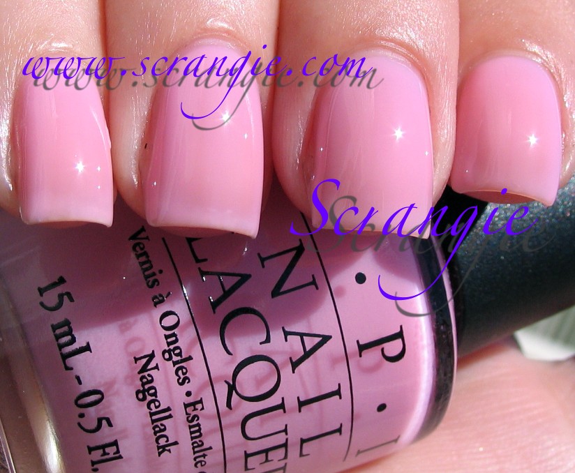
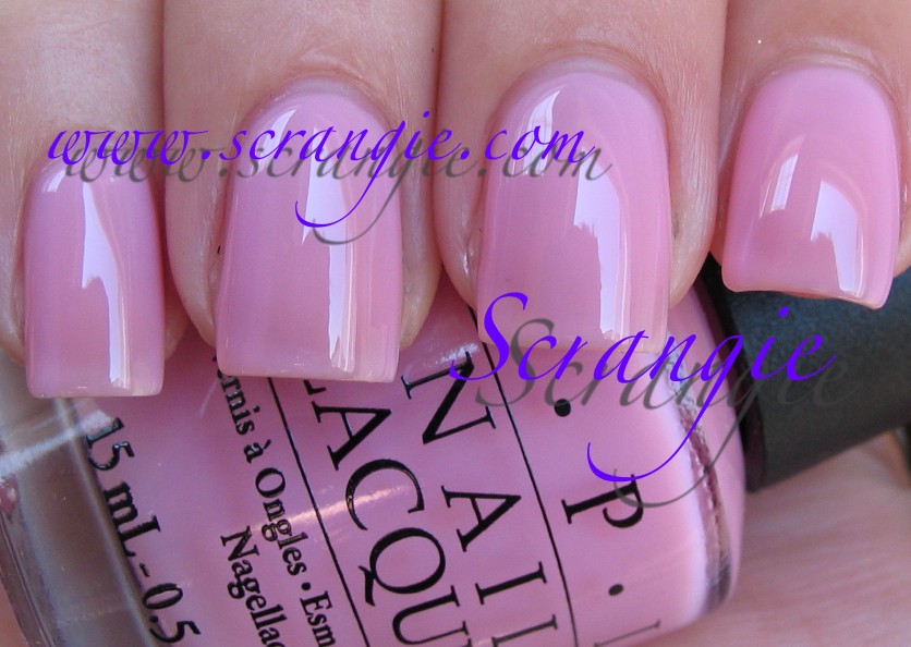 Isn't That Precious? Soft pink sheer. Has that kinda squishy-jelly-soft look that I like. It's a creme, no shimmer.
 I Think In Pink. The darkest and most opaque of the bunch, but still not dark by any stretch of the imagination.
 It's A Girl! Genius, OPI, genius. I can see this shade being super popular for the name alone. Think of all the baby shower gifts! It's A Girl baby pink nail polish! But now they need to do a stereotypical baby blue "It's A Boy" to match. It should come with bubblegum cigars.
 Pink-a-doodle. Oddly, the only one that doesn't start with 'i' is also the only shimmer. It's very subtle and a little hard to see, but this pink sheer does have a soft shimmer to it. But I do have to say... Pink-a-doodle?? Huh??
The formula on these was a bit tricky for me to use. I generally find that pink sheers are thick in consistency- and these were a little on the thick side. They're all sheers, so I did four coats. Thick plus multiple coats rarely ends well, so if you're doing as many coats as I did, let them dry for a minute or two in between to avoid that clumping-globbing effect. They do excel in not being streaky on the first coat, so if you're into the sheer look, these will work for you.
Now you may ask, "What's the difference between these colors? How do they compare to each other?" And honestly, I have no idea. They look so similar to me that I'm having a hard time finding a way to describe how exactly they're different. I think in this case the idea is to pick the sheer that best suits your skin tone.
Honestly, I liked last year's Soft Shades collection better. Remember it? They were sheer pinks and whites but they had this really neat contrasting shimmer/flash. These are just plain old pink. A little milky and slightly jelly-ish, but still... plain pink. Not that they are ugly, though, cause I don't find them ugly. They're not streaky, not so sheer you need 97 coats and they're actually pretty flattering on my hands... They're just not my thing. And the collection is clearly labelled "Soft Shades" so it's not like we're getting surprised with sheer pinks instead of colors in a regular collection. So yeah, if you like sheer pinks, woohoo! Awesome for you! I'll be waiting patiently for the next collection ;-)
(These were sent to me for review.)
Heads up - Rescue Beauty Lounge
Due to popular demand, Ji at Rescue Beauty Lounge has brought back sold-out shades Scrangie and No More War! How cool is that? I believe there are once again a limited number of bottles, but Rescue is accepting pre-orders now. The link to pre-order is here: http://www.rescuebeauty.com/category/nail-polish-scrangie-NMW.html
Hope you can grab them if you missed out the first time!



