Wednesday, March 28, 2012

Blue Comparison

Here's a quick comparison of the most vibrant blue shades in my stash. Sorry I didn't have this up before the Rescue Beauty Lounge pre-order :(

Also, before I get to the comparison, has this happened to anyone else?

I had originally planned on including Illamasqua Force in this comparison because I remember it being an amazing bright blue creme, but when I took it out of its box, I saw this:

It turned a faded, dusty purple creme! WTF? I thought I was going crazy because I clearly remember this polish being blue, but I looked through every Illamasqua polish I have just to double check in case I was remembering the name wrong, but no... It was this one and it used to be blue. I don't know how this could have happened. It's been stored in its box, in a drawer, away from sunlight ever since I last wore it in 2010. Would have been worth comparing if it hadn't changed. Anyway. On to the blues.


Left to right (pinkie to index):
Rescue Beauty Lounge IKB:2012, three coats plus topcoat
ORLY Royal Navy, three coats plus topcoat
Revlon Royal, three coats plus topcoat
Rescue Beauty Lounge IKB:2012, three coats plus topcoat

None of these are exact matches to each other, but they are similar. They do come across a bit more bold/crisp/clean in photos than they do in real life- each has a slightly more dusty/soft look to the finish, but they're still very bold.

IKB:2012 has the deepest color and the softest finish. The finish looks dustier compared to Royal, and it's the most opaque of the three. The color itself has a bit of purple to it, like it's so blue that it's just about to tip over into the indigo/violet portion of the spectrum. Out of all three, IKB:2012 has the weirdest application, but I've been told that the final release version will have an improved texture.

Revlon Royal is the brightest, but it's not as bright as something like Nubar Blueberry. It has the sheerest formula (I'd call it a jelly), the runniest texture and the longest dry time. It is an amazing color and if you don't want to spend the $20 on the Rescue polish, I think you'd be satisfied with this one.

Orly Royal Navy isn't really comparable in the sense of being a duplicate, but it does have a similar base color to the other two. Also, if you let your bottle sit without shaking it for a while, all the glitter will settle to the bottom and you'll be able to apply it as a slightly glitter-flecked blue jelly. I had to shake my bottle really, really hard to get this much glitter to show up on my nail. It has a thin but easy to apply formula and the second longest dry time.

Models Own Hed Kandi Collection Preview

I don't know about this whole 'Hed Kandi' thing, but those two glitters look pretty cool...


Beach Party - Balearic Cool - Disco Heaven - Ibiza Mix - Hedonist

The Ultimate Party Polish from Models Own and Hed Kandi

For the Girl that wants Pure Party Perfection!

Models Own, the cult destination for of the moment fashion colours has joined forces with Hed Kandi, the world’s most glamorous going-out brand to create a brand new exclusive collection of nail polishes inspired by the party capital of the world, Ibiza. With this year being Hed Kandi’s ten year anniversary on the Balearic party island, the range of five polishes reflects the Hed-turning, fashion- forward glamour that the fabulous brand brings to all their events on The White Isle.

The ‘Hed Kandi collection’ instantly brings to life the recognisable glamorous girls synonymous with the brand, transporting you to the jet-set global dance floor. With three of the brightest Models Own shades and two premium glitters making up the collection this embodies the whole essence

These five flirty shades are guaranteed to take you from day to night and back to day, from city to beach and sunset to sunrise! Starting off with the flirty Beach Party, a sunny, bright and intoxicating polish inspired by the world famous sunsets on the White Isle; Balearic Cool, a crystal aquamarine blue inspired by the waters of Formentera; Disco Heaven, a glittery, gold disco bomb; Ibiza Mix, a dense multi-coloured day-night sparkle; Hedonist, a no inhibition hot neon coral.

Designed to be fun and flirtatious the ‘Hed Kandi collection’ provides the finishing touch to the ultimate party outfit, offering unique colour combinations that are all ultra wearable and bang on trend.

Price: £5 each from Boots stores nationwide, launching in Boots and online from March.

Tuesday, March 27, 2012

bareMinerals READY Eyeshadow 8.0 The Cocktail Hour Limited Edition Palette Swatches and Review

I've been resisting these ever since they came out, but after walking past the display at Ulta one last time and feeling how soft and rich the shadows felt, I finally caved and ordered one. There are currently two bareMinerals READY Eyeshadow 8.0 palettes, a warm (The Playlist) and the one I have, The Cocktail Hour, which is cool toned.


The palette comes in a shiny metallic red box with gold foil accents. It's quite striking. The front flap unfolds so you can remove the palette from its cardboard pocket. The back of the box has a full ingredient listing and has the names and colors of the shades in the palette.


The palette itself is a shiny, mirrored gold. It hinges open to reveal a full-size mirror, a mini double-ended eyeshadow brush and eight penny-sized shadows.


Bare Escentuals bareMinerals READY Eyeshadow 8.0 The Cocktail Hour
Top row: Black Tie Optional, Icebreaker, Swanky, Spiked
Bottom row: Elixir, Invite Only, Libation, Shaken Not Stirred


Black Tie Optional, Icebreaker, Swanky, Spiked
(No primer, natural light)


Elixir, Invite Only, Libation, Shaken Not Stirred
(No primer, natural light)

What I liked:
  • The shadows have an amazing texture. They're soft, smooth, creamy, silky, basically what every shadow should feel like.
  • The shades are versatile.
  • The payoff was great on almost every color.
  • Some of the colors have a really fine microglitter type sparkle that actually sticks to the eye and looks really delicate and pretty.
  • The packaging is beautiful.
  • The little brush they included is actually useful- not too scratchy or limp.
  • Much less messy and a lot more convenient than the little jars of loose shadow Bare Escentuals / Bare Minerals is known for.
  • Better color payoff and easier blending than the loose shadows.

What I didn't like:

  • The colors are pretty bland. They can look a little muddy and I don't feel like they all compliment each other.
  • Most of the shades are super frosty.
  • Most of the shades apply a different color than they look in the palette.
  • The lavender shade fades really quickly.
  • The mirror-like palette is a magnet for fingerprints and scratches.
  • The sparkles in Shaken Not Stirred don't show up on the eye.
  • $40 is a lot for this. Yeah, the shadows feel amazing, but they're small (net weight of the palette is 8g / 0.28 oz). For comparison, the Urban Decay Naked Palette has a net weight of 14.4 g / 0.6 oz (twelve shadows), a mini primer and a full sized brush for only $48.

Overall, the quality is there but I'm not wild about the colors. I should have gotten The Playlist, but I changed my mind at the last minute because I thought it would be too warm for me. The shades in The Cocktail Hour are all really good as staple/everyday shades (especially the taupe), but I wish there was something in here that didn't look so muted/muddy, just to liven things up a bit. I'd definitely buy another READY palette if the colors were more interesting, the texture of the shadows is awesome. My only real complaints are that the colors are dull and that $40 is too much for such little product.

I got mine from beauty.com, but Bare Escentuals and Sephora also have the READY 8.0 palettes. They're both limited edition.

Sunday, March 25, 2012

Zoya Surf Collection Summer 2012 Swatches and Review

Now here's the good stuff- part two of the Zoya summer 2012 collection, Surf. This set is all foil and metallic finishes with bright, punchy colors. The colors in the Surf collection are:


Rory - Carly - Kimber - Myrta - Meg - Zuza


Zoya Carly. This is a color I would have expected in a fall or winter collection, but that's okay because it's amazing. It's a red-based purple foil. It will look lighter and more red-toned at some angles, but darker and bluer at others. This applies with really dense color and shimmer and it positively glows.


Zoya Kimber. Another amazing color, but it's so bright and colorful that my camera can't seem to focus on it! It looks a lot more red here than it is in real life. It's the same as this in intensity, but it has a gorgeous warm, super-saturated pink jelly base instead of the red base it looks like it has here. It doesn't seem to be a foil like the rest, but has some very shiny gold shimmer that peeks through and gives the color depth instead of looking metallic. Super gorgeous color.


Zoya Meg. This one's a true foil in a light apple green color. Yellow-toned, my favorite kind of green. It looks very sparkly in the sunlight, and the sun also brings out a lot of iridescent shimmer particles that you don't see in low light.


Zoya Myrta. Another foil, but in a soft orangey-coral color. It's a red-toned orange/coral this time, and it's colorful but doesn't seem too bright or punchy.


Zoya Rory. Odd... but not bad. It's a light pink/mauve foil where a lot of the silver foil base pokes through and gives it a speckled look. Zoya has a Rory but no Amy? And, for that matter, a Rose but no Martha or Donna. Though they do have Melodie, Sarah & Jane, and Jo...


Zoya Zuza. Like Kimber, this is another one of those colors that you have to see to appreciate. It's so much more vibrant and colorful in real life and it looks flat on camera. Anyway, this is a teal/blue-green with some speckly-looking metallic foil shimmer. I think this one might be my favorite of them all. It's so rich looking and summery. Perfect summer pedicure color, if you ask me.

The formula on these was also good. They go on very smooth, but you have to be careful not to use too many strokes when applying because they start to dry very quickly (like a matte) and can get lumpy/chunky if you go over it too many times once it's started to dry. Give them a minute or two in between coats and you won't have a problem. I did three coats of each and each looked best at three coats. The extra coat adds a little extra color and density to them. Good dry time on these, even at three coats.

I like these much better than the Beach collection colors. Zuza, Kimber and Carly are AMAZING. Myrta, Rory and Meg are okay, but I don't really love them. The finish on these looks great in the sunlight and the bright colors are much more cheery and summery feeling to me than plain pink.

The Zoya Surf and Beach collection will be available starting April 1st on Zoya.com.

(This was sent for review.)

Saturday, March 24, 2012

Zoya Beach Collection Summer 2012 Swatches and Review

The Beach collection. Part one of a two-part summer color collection, this half has all the creme shades. The other half has all the shimmers. The colors in the Zoya Beach collection are:


Reagan - Lara - Shelby - Arizona - Tracie - Wednesday


Zoya Arizona. Arizona is a light orange creme. It's not pastel, but it is lighter than most orange creme polishes tend to be. It has a yellow tone to it so it looks more like coral than pumpkin.


Zoya Lara. This is a medium fuchsia creme. I know it looks neon here, but it's really not. In real life it has a soft but very pigmented look, just like the bottle color in this picture.


Zoya Reagan. This is a darker fuchsia, not quite purple but not berry either. Right in between. It's not particularly bright, but it is very colorful. Lots of pigment to this one.


Zoya Shelby. Another pink! This one is light, slight blue tone, slightly brighter finish than the others. It's not neon and it's not pastel, but it does really stand out on the nails. It dries darker than bottle color.


Zoya Tracie. Tracie is the only non-creme polish in the collection. It's a soft avocado shade with some very fine frosty shimmer. Not enough to make it sparkly, but just enough to give it a slight pearly finish.


Zoya Wednesday. This is a faded-looking beachy turquoise. It has a lot more green to it than my camera will pick up, and it's also coming out brighter in my pictures than it looks in real life. In reality, it's very soft and muted looking, not as crisp as it seems here. Refer to the group shot's bottle color- that's how it looks in real life. Love the name, but I'm somewhat disappointed that it's cheery turquoise and not black.


The formula on these was good. It's a little thicker in texture than the last two creme collections, so it's much easier to control without it running or pooling as much. The texture is very smooth, but it does still have a slight tendency to drip when you least expect it. Opacity is good- most looked fine at two coats, but I did three of all just because they looked that much better with the extra coat. Dry time is average.

Personally, I'm not sure I like this collection. Or at least half of it. The three pinks seem so overdone and not at all unique, plus they don't even feel like summer colors to me. They're not really very bright, but they're not faded enough to look like they fit with the retro/vintage vibe of the other half of the collection. The other three polishes, Tracie, Arizona and Wednesday, are great. They seem less easily dupe-able than the pinks, they're beautiful on the nails, and they definitely give off a retro-vintage-beachy feel to me. I really like the dusty/faded/antique look they have.

The Zoya Beach collection will be available April 1st on Zoya.com.

(This was sent for review.)

Friday, March 23, 2012

OPI NYC Ballet Soft Shades Collection Spring 2012 Swatches and Review

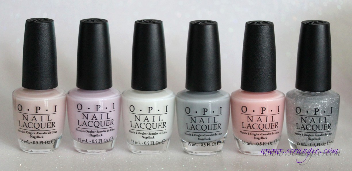
OPI's Soft Shades collection this year is inspired by the New York City Ballet. It's an assortment of five light, sheer shades (beige, lilac, soft white, grey, peach-pink), plus a sparkly layering glitter that can be worn alone or layered over any of the soft shades. This collection surprised me. I thought they were just going to be boring/plain sheers based on the promo pictures, but when I got them on my nails, I suddenly realized they weren't. They're JELLIES.


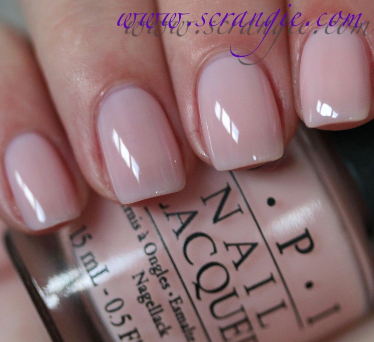
OPI Barre My Soul. A light white-based soft beige. It has a some peach in it so it doesn't look straight beige and flat, instead it looks more like a very light fleshy color with dimension to it from the jelly finish.


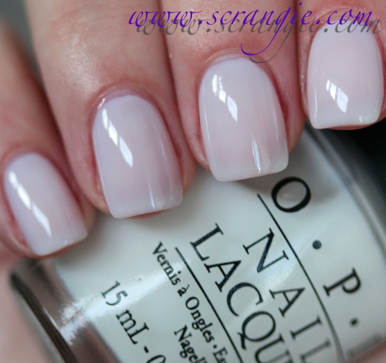
OPI Care To Danse? This one is a very, very pale lilac. It also appears white-based when it's on the nail, but not stark or chalky. It looks a little more pink-colored in real life, but it seems more purple in the bottle.


OPI Don't Touch My Tutu!. This is a soft white jelly. It doesn't seem to have that subtle blue undertone in it that Essie Cloud Nine has, but it still has a similar brightening effect. This is such a dreamy white. It looks like fluffy clouds and marshmallows.


OPI My Pointe Exactly. Now there's something different. A grey jelly. This grey is blue toned, and in some lights it looks more like a slate blue than a pure grey. You would think that a sheer grey would just look murky and dirty, but it doesn't. It actually looks really good and that lovely jelly finish gives it depth that opaque cremes don't have.


OPI Pirouette My Whistle. This is a very fine light silver glitter and a small pearl white hexagon glitter in a clear base. This is a sheer glitter that's perfect for layering (not so dense that it covers the base color too much, not so sheer that you need multiple coats for it to show up), but I think it actually looks nice alone. The glitter is very delicate and twinkly, reminds me of those very old OPI holiday glitter topcoats like Yule Love This Silver and Nutcracker Sweet with that superfine sparkly type of glitter.


OPI You Callin' Me A Lyre? This one is a peachy pink. It has a little more color to it than your typical OPI Bubble Bath / Essie Ballet Slippers type of shade to keep it from looking too corpse-y. I normally don't like these nearly-white pinks because it makes it look like I've lost all the blood flow to my fingers. You Callin' Me A Lyre looks a little more lively than that.

The formula on these was also a surprise for me. With these types of colors, I usually expect them to be streaky, watery, or uneven in some way. These apply like a dream, streak-free and self leveling. At one coat they look like a sheer, streak-free color gloss and it actually looks really nice; soft and clean. The white base and jelly finish in the shades gives this blurring/softening creamy effect. Here's how they look at one coat:

OPI Barre My Soul (one coat).


OPI Care To Danse? (one coat).


OPI Don't Touch My Tutu! (one coat).


OPI My Pointe Exactly (one coat).


OPI You Callin' Me A Lyre? (one coat).


Since they're not streaky, you can wear as many coats as you'd like. They look like a subtle creamy gloss at one, slightly more opaque at two (but the jelly finish becomes more apparent), and perfectly jelly-like at three:

Don't Touch My Tutu! - one coat.


Don't Touch My Tutu! - two coats.


Don't Touch My Tutu! - three coats.

To make the already nice polishes even nicer, you can layer them with a coat of Pirouette My Whistle. Horrible name, fantastic color.

In the bottle, Pirouette My Whistle looks like it might be chunky. It has some small but substantial looking hex glitter and also some near-microglitter sized silver flecks. Luckily, this glitter is so light that it lies completely flat and smooth on the nail and it doesn't do that annoying thing where the glitter sinks into the wet polish and leaves little divots near every particle. Reminds me of Nubar White Polka Dot, but not an exact match. Here's how each shade looks layered with Pirouette My Whistle:


OPI Pirouette My Whistle (one coat) over Barre My Soul.


OPI Pirouette My Whistle (one coat) over Care To Danse?.


OPI Pirouette My Whistle (one coat) over Don't Touch My Tutu!.


OPI Pirouette My Whistle (one coat) over My Pointe Exactly.


OPI Pirouette My Whistle (one coat) over You Callin' Me A Lyre?


The formula on these was perfect. The texture was thicker than the average watery sheer and that prevented the running/pooling problem I usually have with these types of colors. They weren't streaky as long as I paid attention to how hard I was pressing the brush, and they seem to self-level really well if I did apply them unevenly in some areas. They're sheer, but at three coats (what I'm wearing in the photos) they look like a perfect creamy jelly on me. They dry very fast and every shade dries to a glossy finish (even the glitter) without added topcoat.

You know, as much as I normally hate sheers and soft shades, I have to admit that I actually like these. It's that milky jelly finish. I love jellies, and when they have that added milky look, forget it. Instant like. It looks so squishy and soft and dreamy, like clouds and marshmallows and fluffy bunnies... They're so cute that it's almost sickening. The softness and depth of the milky jelly finish makes the nails look clean and well groomed, not dead and lifeless, and the formula is perfect. Adding the delicate glitter on top just takes it to the next level of cute. I'm also impressed with how shiny/bright/twinkly the glitter is without it being chunky or gritty or hard to remove.

All in all, while I don't normally "do" sheers (especially sheer pinks, ugh), the milky jelly finish on these is really appealing to me. I just can't help myself, they're too cute not to love. I'll likely only wear the lilac and grey with any regularity, but I've been wearing Barre My Soul with Pirouette My Whistle since last night and I have no desire to take it off yet...

The OPI NYC Ballet Soft Shades collection officially launches in April, but they are already available in some stores.

(This was sent for review.)